Real Estate | Admin Summery Dashboard
Overview:
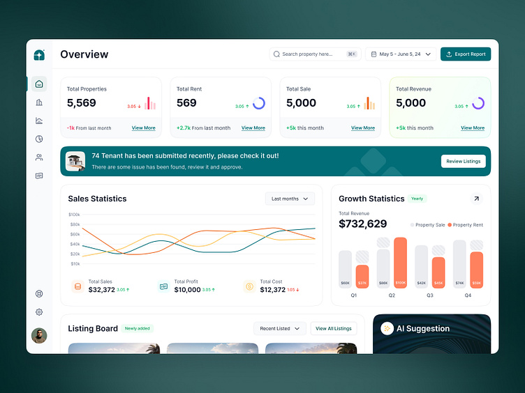
The Real estate admin dashboard aims to provide property managers with a comprehensive, intuitive, and visually appealing interface to monitor key metrics, manage property listings, and gain insights into sales and revenue. The clean and modern UI ensures that users can easily navigate through various sections, track performance, and take necessary actions efficiently.
UX Elements:
Navigation Menu: The left sidebar offers easy access to key sections such as Overview, Listings, Sales Statistics, Growth Statistics, and Settings. This organized layout helps users quickly find the information they need.
Notification Banner: Prominently placed to alert users to important actions, such as tenant submissions that require attention. The banner is visually distinct to capture immediate attention.
Interactive Charts: Sales and growth statistics are presented in interactive graphs that allow users to hover over data points for more detailed information, enhancing data engagement and understanding.
Listing Board: Displays recently added and newly listed properties with images, location details, and pricing. This section is easily scannable, allowing users to quickly assess new opportunities.
AI Suggestion Panel: Provides personalized, AI-driven insights and suggestions, enhancing user decision-making with relevant, timely information.
Color Scheme: The dashboard uses a modern color scheme with primary hues of green and white, creating a clean and professional look. Green signifies growth and positive changes, while red indicates declines.
Typography: Clear and legible fonts are used throughout, ensuring information is easily digestible. Bold titles and smaller body text maintain a clear hierarchy.
Icons and Imagery: Simple, flat icons and high-quality property images enhance the visual appeal. Custom icons for metrics and notifications aid in quick recognition and provide a cohesive aesthetic.


