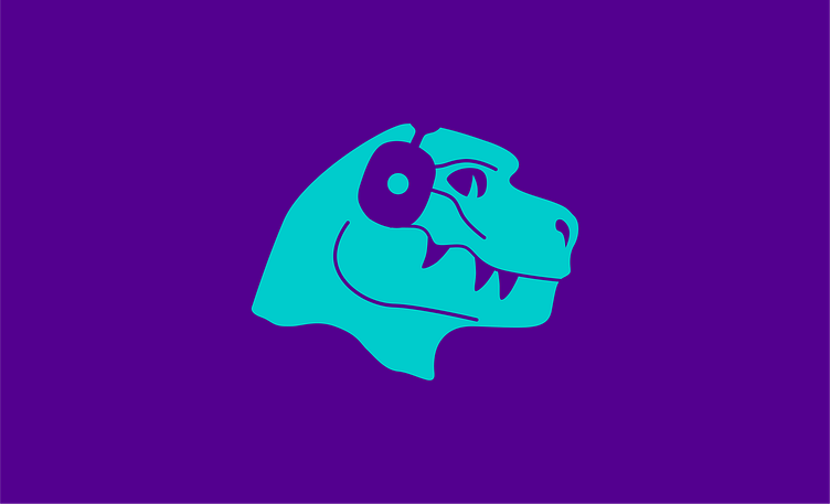
THREE TEETH REX -Option two
For this option, the client wanted a more prominent coffeehouse visual in the design and bolder, intriguing colours to spark curiosity—also, a typeface with no additional treatment for improved legibility.
"This design was specifically created for the brand; however, the client was unable to make a decision."
So, I decided to trap the logo to make it more uniform and intentional when used in any brand collaterals. I retained the same Rex illustration, which feels more on-brand. I decided to place it smack inside a bounding capsule shape and also with a few keywords from the client, "Coffeehouse," "Discovery," and "Imagination," which fueled my innovation.
I intelligently illustrated a house inside a coffee bean for the word coffeehouse. If you noticed some lines around the illustration, those lines mean signals like a WIFI signal trying to link the logo to the tech space.
I created other logo layouts for use on brand collateral, including a semi-logo badge, which will be great for telling people more about the brand and its established year.
I've chosen bold and attractive colours for the colour palette. These vibrant colours, whether used alone or together, will pique people's interest and make them curious about the brand.


