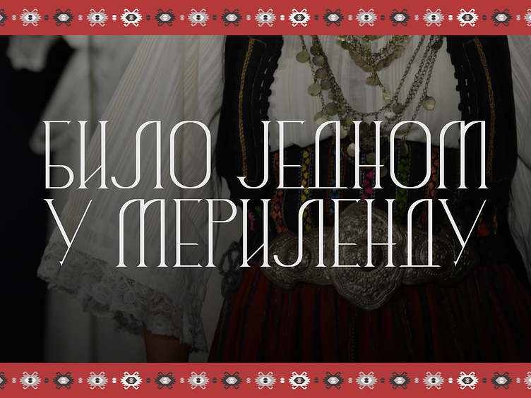
Once Upon a Time in Maryland - book design
A publishing house, inspired by my work on the branding of the village of Bradić, approached me with the need to create original typography and cover design along with accompanying graphic elements in the first phase, and photo editing and book layout in the second phase for a monograph by Biljana Regan, a Serbian collector and preserver of Balkan folklore from Washington, USA.
Biljana is believed to own the largest folklore collection of its kind on American soil.
The initial typography proposal, named Žalfija (Sage), was characterised by sharp graphics with expressive decorative curves aimed at serving the purpose of further graphic elements.
It is shown here in its general form, leaving room for further decorations on specific letters.
An example of additional decoration of certain letters and splitting the text into semi-words or rotating the title to maximise the typography’s impact.
I based this part on typographic options, with the idea also being to add a photo to the cover and resolve other details for which I had to wait to receive the material for the book. This is just an illustration of the initial ideas.
Taking the decorative letter M as the main element (location of the book, the most resonant part of the book’s title), by adding a central line and further replication, we get Klasje (Wheat) - a trellis pattern that can be used as a standalone element or further duplicated to create a pattern for greater coverage of a part of the page, a decorative accompanying element to photographs, or a photo frame.
Additional ornamental graphics derived from other letters - here I had the idea to brand each chapter differently with a graphic, a wreath, or a vine made from typography that would serve an additional decorative purpose.
However, the client decided against the original typography and wanted Iverak, the typography developed for the branding of the village of Bradić, on the cover.
We tried a few more options with my custom fonts, but in the end, we agreed that the typography for the cover and the inner chapters would be Iverak.
At the same time, we began working on the graphics for the cover - inspired by the Pirot carpet below.
After setting up the graphics, typography, and branding of the book, we were able to start with text layout, photo editing, and print preparation.
*The texts shown in this project have been altered to keep the focus on the visual elements rather than the content. Additionally, the agreement with the client is not to display the content outside the book, as its promotion is still in progress.
Also, there were further changes to certain parts after my final preparation for print, so the printed edition of the book is partially different from what is shown here. Nevertheless, this project represents my final work on the project.
I would like to thank Impressions Publishing for this collaboration that bridges geographical and cultural boundaries.
It pleases me immensely that this book has been included in the collection of the Library of Congress of the USA, and that Serbian traditional symbols through my fonts and graphics are now part of such a collection.
Content ©️ www.impressionspublishing.com


