Payment Page Design
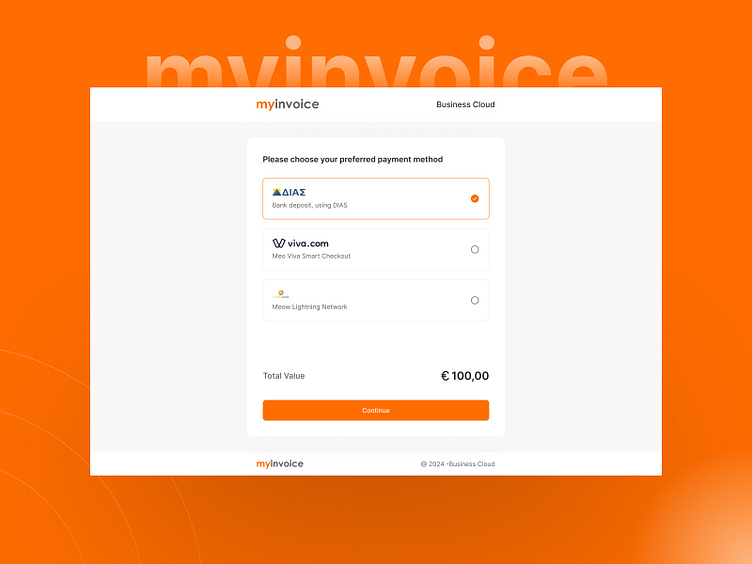
In the design of the payment interface, the primary focus was on creating a minimalistic & intuitive experience. The use of the brand's color palette ensures a consistent and recognizable look, while the selection of the Inter font family adds to the overall readability and modern aesthetic. The design's simplicity not only aligns with current UI trends but also facilitates a straightforward and efficient user journey, making the payment process both visually pleasing and user-friendly. The goal was to eliminate any unnecessary elements, resulting in a clean and focused interface that enhances the user's interaction with the payment system..
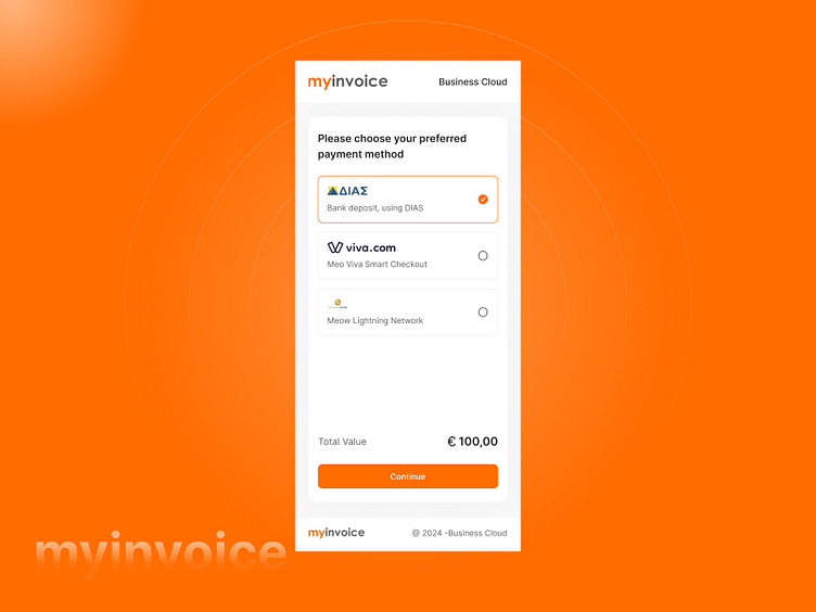
In the redesign of the payment interface, the primary focus was on creating a minimalistic & intuitive experience. The use of the brand's color palette ensures a consistent and recognizable look, while the selection of the Inter font family adds to the overall readability and modern aesthetic. The design's simplicity not only aligns with current UI trends but also facilitates a straightforward and efficient user journey, making the payment process both visually pleasing and user-friendly. The goal was to eliminate any unnecessary elements, resulting in a clean and focused interface that enhances the user's interaction with the payment system..
