GAME WORLD
Overall, the "Game World" logo is a well-thought-out design that effectively combines text, gaming imagery, and global elements to represent a community-driven gaming brand. The use of bold fonts, colorful buttons, and a recognizable game controller ensures that the logo is eye-catching and memorable.
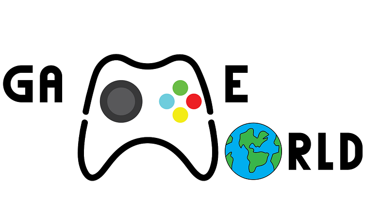
The "Game World" logo is an imaginative and captivating design that skillfully merges gaming elements with a global theme. Here’s a detailed description:
Central Element:
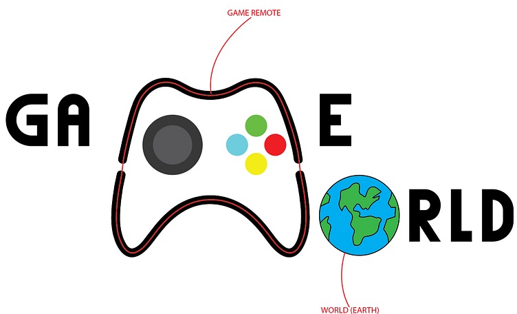
- Gaming Controller: The focal point of the logo is a simplified, black outline of a gaming controller. It is centrally placed and designed to resemble a modern gamepad, adding a recognizable gaming element to the logo.
- Buttons: Inside the controller, there are four colored buttons – green, blue, red, and yellow – adding a vibrant and playful touch to the design.
- Joystick: The joystick is represented with a gray circle, emphasizing the interactive nature of gaming.
Graphic Element:
- Earth: The letter "O" in "WORLD" is replaced with a graphic of the Earth, symbolizing global reach and community. The Earth graphic features blue oceans and green continents, outlined in black, which adds a colorful and dynamic aspect to the logo.
The logo for "Game World" is a creative and engaging design that cleverly integrates elements of gaming and global connectivity. Here’s a detailed description:
Text Elements:
- GA: On the left side of the logo, the text "GA" is presented in bold, black, modern sans-serif font. The letters are evenly spaced and well-aligned, providing a solid and balanced beginning to the logo.
- E: To the right of the central gaming controller, the letter "E" is in the same font and style, maintaining visual consistency and symmetry with "GA".
- RLD: The word "RLD" follows the letters "RLD" are in the same bold, black font, harmonizing with the other text elements.
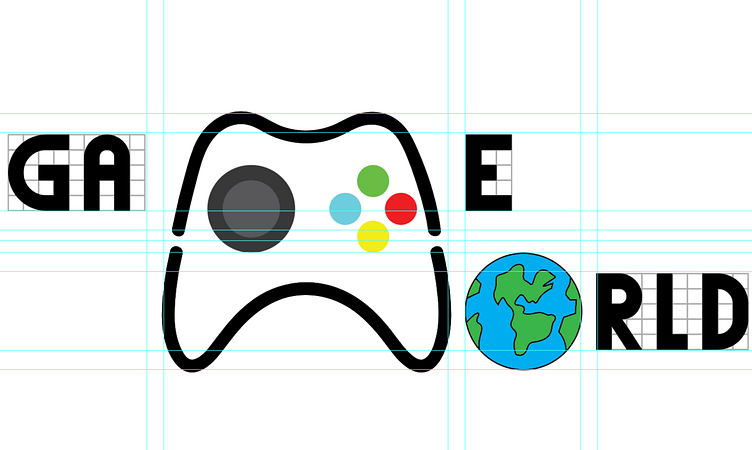
Design Guidelines:
- The logo is accompanied by blue grid lines, which are used as guidelines for precise alignment and proportional consistency. These lines ensure that all elements of the logo are well-balanced and symmetrically placed, enhancing its overall visual appeal.
