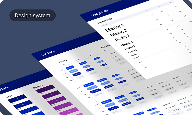
My journey to a comprehensive design system
The seed of innovation
Today, I want to take you on a journey through the creation of a design system that promises to improve the way we approach design. This isn't just a toolkit - it's a meticulously crafted ecosystem designed to bring scalability, consistency, and an enhanced user experience to the forefront. Let's dive into how this came to life.
Learning from the Giants
Every great design starts with research, and mine began with a deep dive into the world of design systems by some of the biggest names in the industry. I pored over the intricacies of systems from Atlassian, Google, Apple, and others. Each offered invaluable lessons on structure and the essential elements that make a design system robust. This comparative analysis wasn't just about understanding what works, but about discovering the why behind their success.
Building the foundation
Armed with insights, I moved to the definition stage. This phase was all about pinpointing the unique needs of our product and establishing clear, precise guidelines. Colors, spacing, typography—every component was thoughtfully considered. The goal was to create a cohesive framework that would not only meet our immediate needs but also adapt as those needs evolvedю
A new era of design efficiency
The culmination of this journey is a design system that transforms how we prototype and develop. It significantly slashes the time spent on these tasks while infusing a modern, standardized, and user-friendly approach. The benefits are clear: faster development cycles, a unified visual language, and an overall improved user experience.


