Ateneum
Case Study: Redesigning the Website for Ateneum
Background
Ateneum, a renowned museum showcasing a vast collection of contemporary artworks, faced significant challenges with its website. Despite its impressive physical collection, the online presence failed to reflect the gallery's prestige and accessibility. The gallery's website was plagued with various issues, leading to a poor user experience and a lack of engagement from visitors.
Redesign Strategy
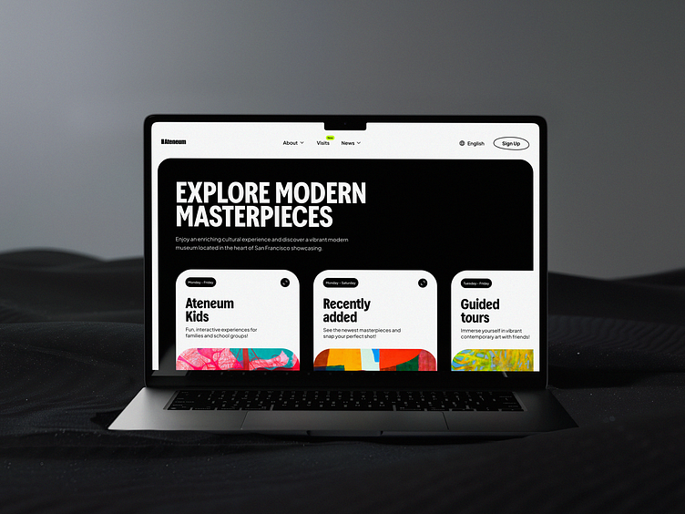
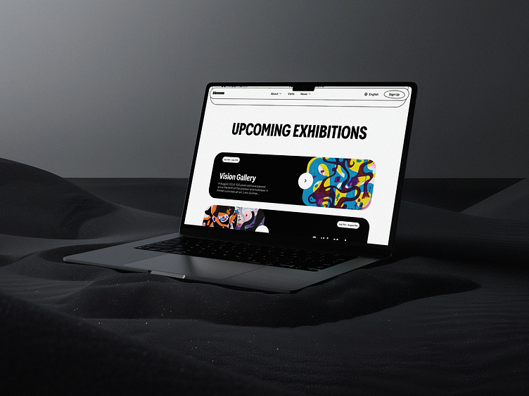
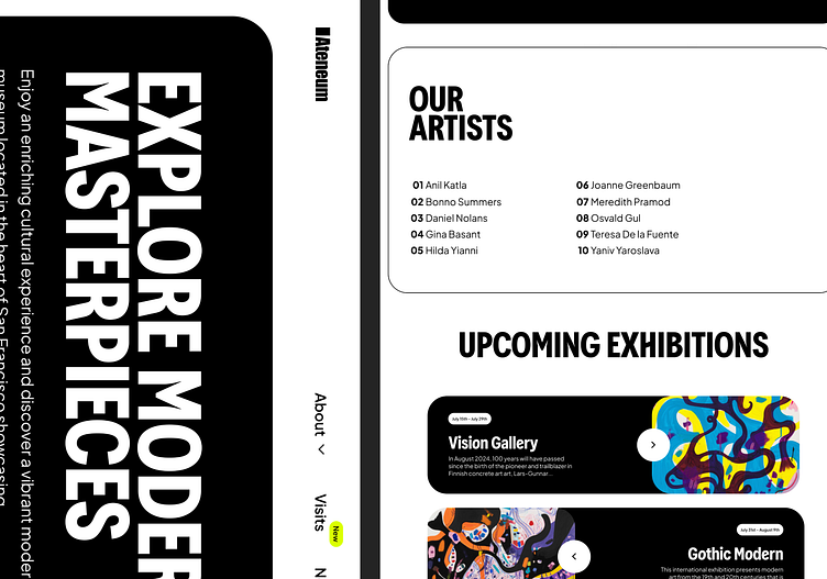
To address these challenges, I implemented a comprehensive redesign strategy with several key objectives like primary color scheme, simplified design, enhanced user experience, intuitive menu, visible navigation, and more.
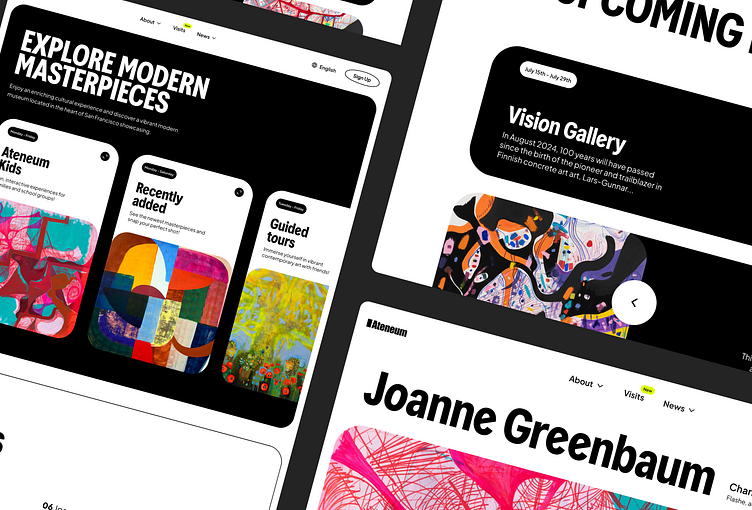
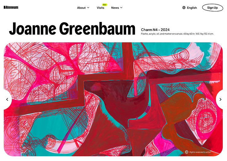
The redesigned website adopted a minimalist color scheme with black and white as the primary colors. This allowed the vibrant and diverse artworks to stand out, drawing the viewer's attention to the art rather than the website's design elements.
Results
The redesigned website for Ateneum resulted in a significant improvement in user engagement and satisfaction. Key metrics, such as time spent on the site, page views, and user feedback, showed a marked increase. Visitors appreciated the clean, modern design that allowed the art to take center stage. The intuitive navigation and improved search functionality made it easier for users to explore and interact with the gallery's offerings. Overall, the redesign successfully transformed the online presence of Ateneum, aligning it with the gallery's esteemed reputation and enhancing the digital experience for art enthusiasts.
