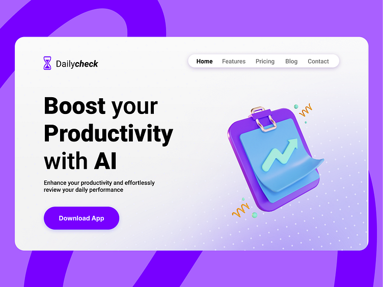
Daily UI Challenge- Landing Page
Minimalist Landing Page for Productivity Platform 📈
Hey Dribbblers!
I’m thrilled to share my latest design project – a minimalist landing page for a productivity platform. The goal was to create a clean and efficient user interface that highlights the platform's features while maintaining a sleek and modern aesthetic.
Key Features:
Streamlined Layout: A user-friendly layout that organizes information clearly and concisely.
Modern Typography: Elegant fonts that ensure readability and add a touch of sophistication.
Minimalist Aesthetics: A focus on simplicity with plenty of white space to avoid clutter and enhance user focus.
Engaging Visuals: High-quality images and icons to visually represent the platform’s functionalities.
Intuitive Navigation: Clear and straightforward navigation to help users find the information they need quickly.
The design is meant to provide users with an intuitive and enjoyable experience, making productivity feel effortless. I aimed to balance functionality with aesthetic appeal, creating a landing page that is both informative and visually pleasing.
I'd love to hear your thoughts and feedback in the comments below. Your input is always appreciated! 🚀✨
#UI #UX #MinimalDesign #LandingPage #ProductivityPlatform #WebDesign #UserExperience

