Catelli — Package redesign
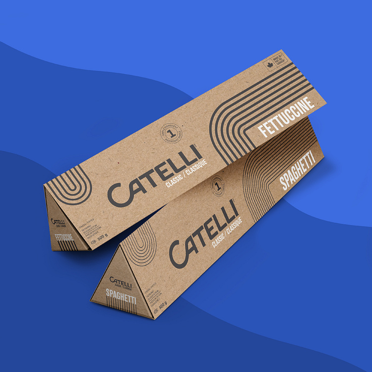
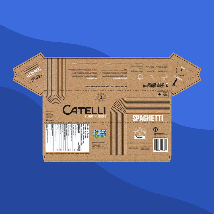
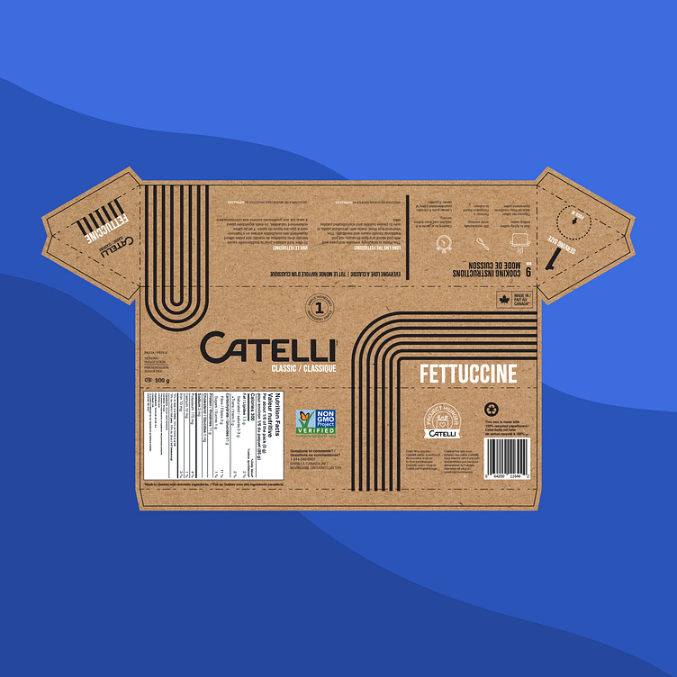
The Catelli pasta package redesign focuses on sustainability and visual distinction. The triangular uncoated kraft paper boxes utilize algae inks to enhance recyclability. For visual clarity, the spaghetti box features thin geometric lines to represent the thinner pasta, while the fettuccine box uses thicker lines to indicate its broader shape. This consistent yet differentiated design ensures easy identification and aligns with the brand’s eco-friendly initiative. Additionally, a convenient pop-out on the side allows for easy single-portion pouring. The innovative shape stands out on shelves and reduces material use and waste, reflecting a commitment to sustainability without compromising on aesthetic appeal and functionality.