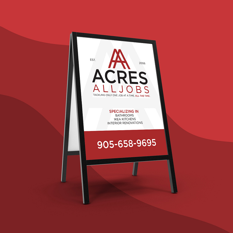
Acres Alljobs — Re-branding and sign design
The rebranding of Acres Alljobs focuses on a modern and adaptable design, reflecting the company’s evolution since its establishment in 2006. The logo’s icon, integrating two capital letter A’s to form a ladder, embodies progress and unity, encapsulating the essence of their services: bathroom renovations, Ikea kitchens, and interior redesigns. Utilizing the Gotham typeface in both Book and Medium weights enhances the brand’s professionalism and clarity. The colour palette, comprising burgundy, white, light grey, and black, signifies stability, cleanliness, and sophistication. These colours work harmoniously to convey the company’s dedication to quality craftsmanship without overshadowing each other. Consistency across advertisements, yard signs, and stationery ensures brand cohesion, with the icon subtly reinforcing brand recognition and enhancing visual appeal. This unified design approach reinforces Acres Alljobs’ position as a reputable and innovative contractor in the competitive renovation industry.


