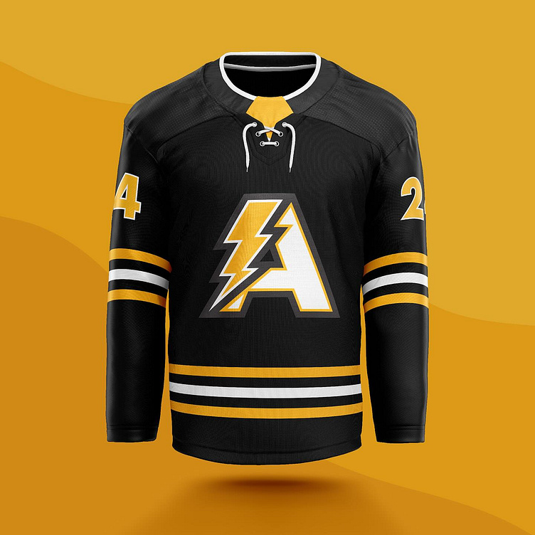
Acton Chargers House League Hockey — Re-branding
The Acton Chargers House League Hockey Association’s rebranding involved a meticulous design process aimed at encapsulating the organization’s essence. The creation of the logo, a stylized letter “A” intertwined with a lightning bolt, underwent several iterations to achieve the perfect balance of modernity and tradition. The chosen black and yellow colour scheme was selected to evoke a sense of professionalism and vibrancy. Each element was carefully crafted to ensure that the rebranding not only reflected the association’s values but also resonated with its diverse audience. This comprehensive approach ensures a seamless transition to a revitalised visual identity that embodies the spirit of the Acton Chargers.
More by Nick Hinchliffe View profile
Like


