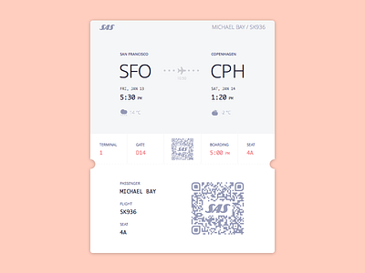
Boarding Pass
In Sam's example of the boarding pass the UI is gorgeous, but it has some UX weakness e.g. when the airport crew cuts the boarding pass the passenger loses the seat information (I mean the printed version), in the same situation they cut the QR code, the only connection between this piece of paper and the airport's system, when they hit some problem the crew needs to find the cutted piece or find the passenger in their system manually. We need to remember that still many people printing the boarding pass at home.
I also worked a bit with colors and tried to make the most relevant information more visible for the passenger. For fun factor, I have added weather information for the origin and the destination.
I know that in her example it was "maybe" a digital version of the boarding pass, but it was fun to make it better and more "usable".


