Brand Identity Development for Groxery

Brand Identity Development for Groxery
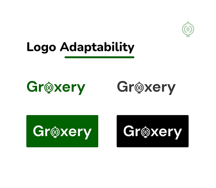
Groxery, a fresh and modern take on grocery branding. This logo showcases the versatility of the design across different backgrounds, maintaining its clarity and charm. The playful use of a stylized onion for the "o" adds a unique touch, reflecting Groxery's focus on fresh produce.
The logo adapts seamlessly to both dark and light backgrounds, ensuring it remains impactful and recognizable in various settings. Whether it’s for digital platforms or print media, Groxery’s logo stands out with its clean lines and vibrant green color scheme.
We'd love to know what are your thoughts on it! 💭
Don't forget to press ❤️(L) and don't forget to follow the Truemark Dribbble account.
--------------------------------
Wanna collaborate with us? Shoot your business inquiry to prabin@truemark.com.np
Find us on: