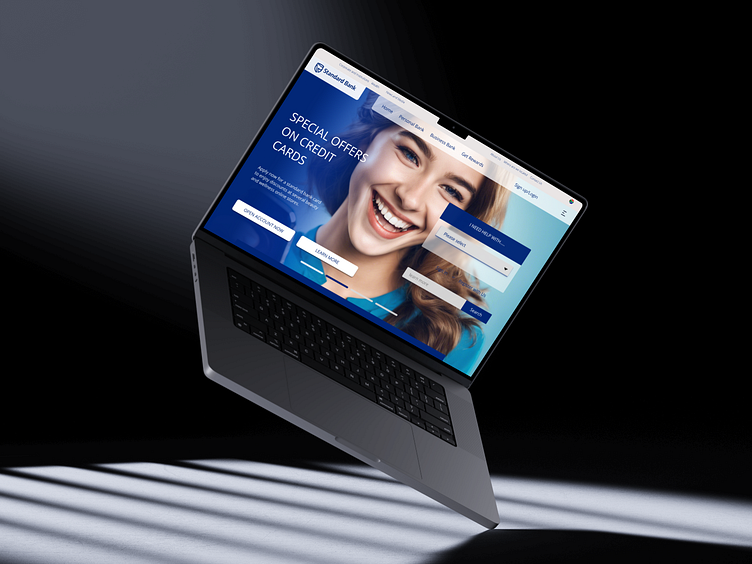
Standard bank Redesign
This is the South African Standard bank landing page re-design. Using psychology, UI, user behavior/user experience
WHY THE REDESIGN:
For better branding color use
High quality imagery to maintain the banks respective and promising identity to customers
Better button use, for users who are sensitive to the color blue, it is wise to use a different color for call-to-action button than the background.
For easy navigation for first time users.
Appear more warm, welcoming, and trustworthy.
Let us connect
More by Sphamandla Xaba View profile
Like


