SAKAIO | LOGO DESIGN & BRAND IDENTITY
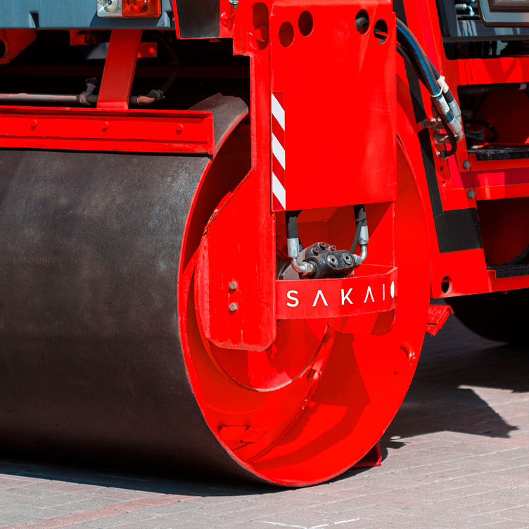
With technology from Japan, SAKAIO construction and construction machinery brand brings outstanding construction solutions and construction machinery, helping to create sustainable and modern buildings, contributing to the development of global infrastructure.
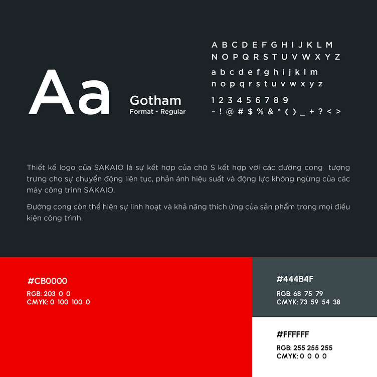
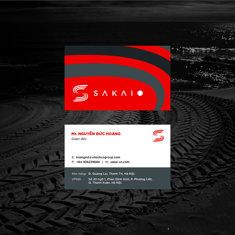
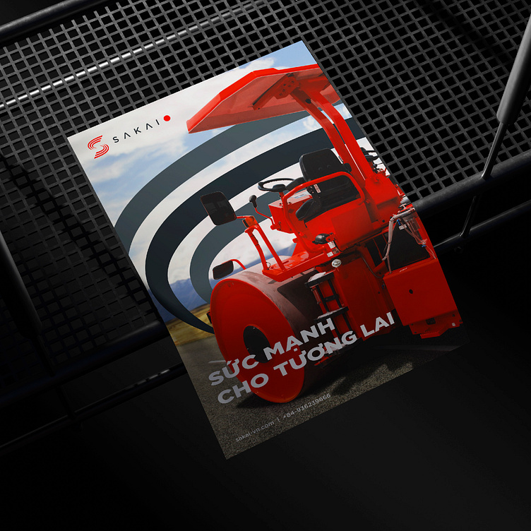
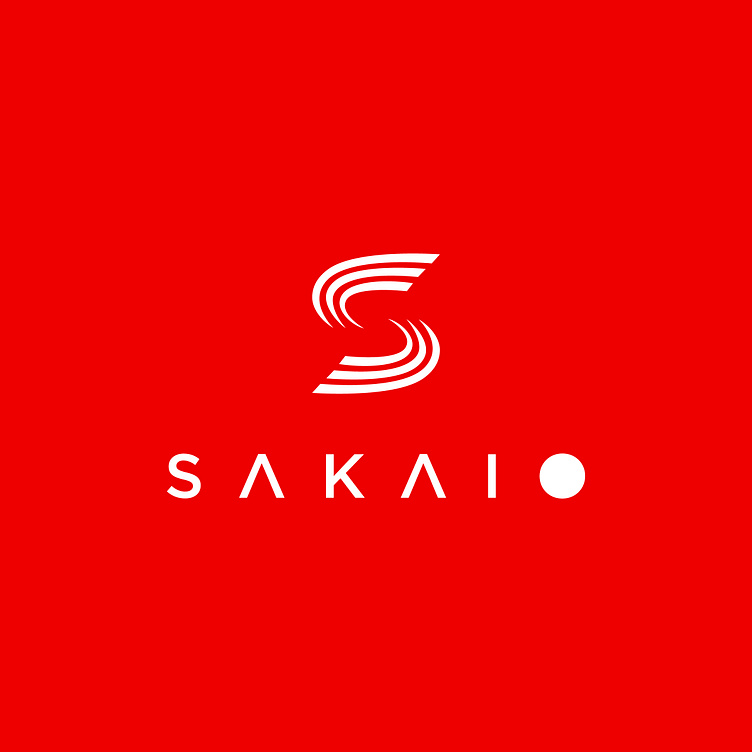
SAKAIO's brand identity is inspired by 2 typical colors of Japan. Red represents strength, enthusiasm and determination. The red color also emphasizes the strength and power of the construction machines, and evokes reliability and safety during use. SAKAIO's brand identity is designed in a minimalist style, focusing on core elements to ensure that the brand is always clear, memorable, and easy to apply on a variety of surfaces and documents. SAKAIO's logo design uses the stylized letter S as the main symbol with soft but strong lines, showing the sophistication and high quality of the product.
The curves symbolize the continuous movement, reflecting the performance and relentless dynamics of SAKAI construction machines. The curve also shows the flexibility and adaptability of the product in all construction conditions.
Designed by Bee Art
-
Client SAKAIO
Logo Design Project. Logo is designed for Construction Machinery Company in Vietnam.
Copyright© Bee Art. All Right Reserved
Contact us:
• Hotline/ Zalo: (+84) 77 34567 18
• Email: info@beeart.vn
• Website: www.beeart.vn
• Facebook: https://www.facebook.com/BeeArt.vn