Flight Dashboard Redesign.
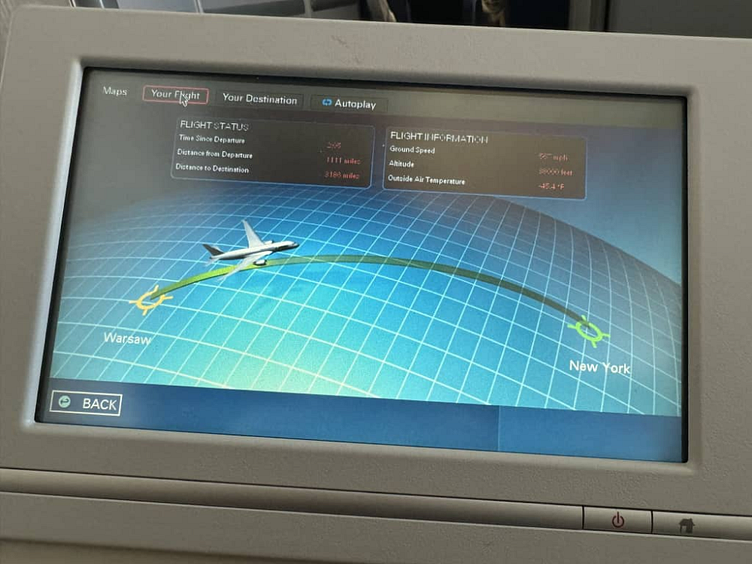
I came across this dashboard snap on social media and I noticed one thing. It starved users of the proper User Experience in the area of visual representation and proper information arrangements. So sad!☹
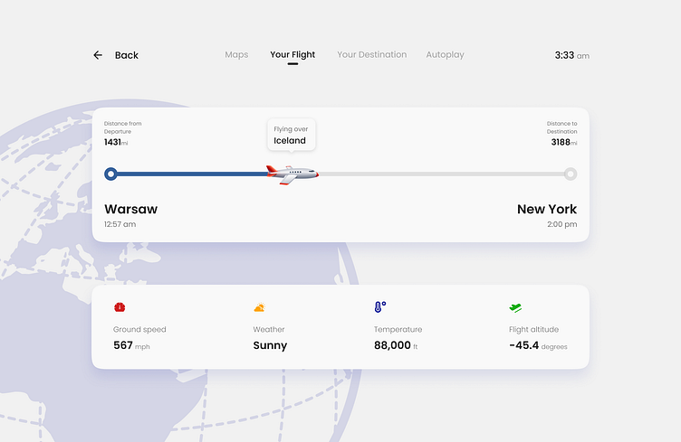
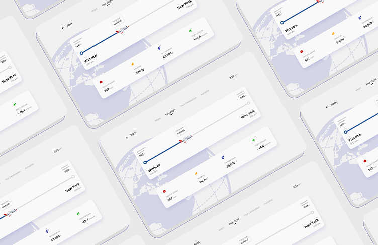
For this, I decided to redesign the dashboard in a visual appealing and modern manner. In a form that would make it easier for travelers to be more interested, in the info before them.
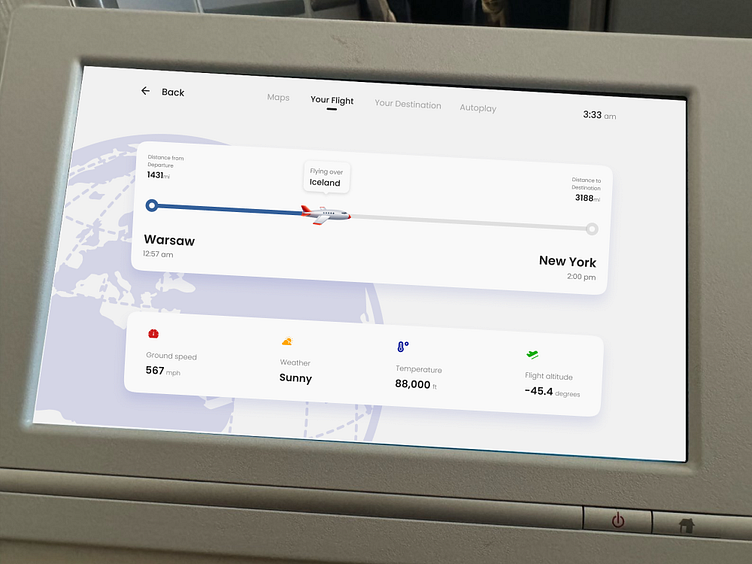
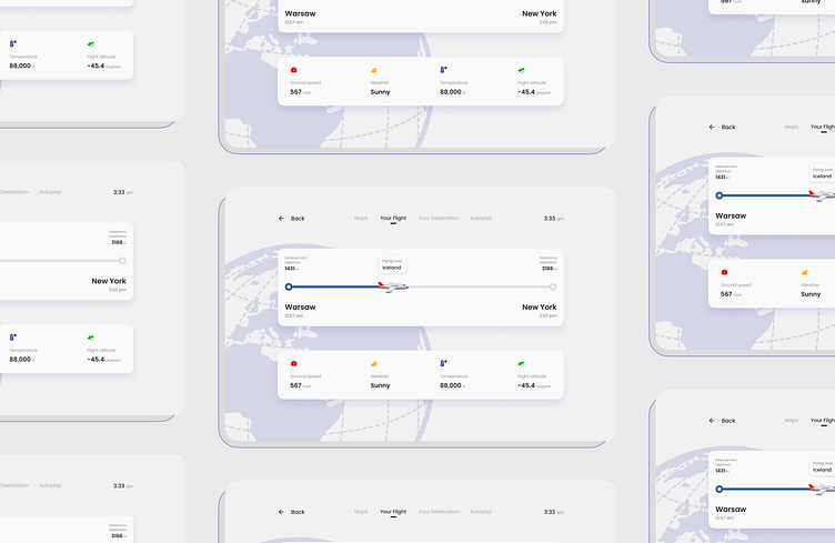
Tried fitting it unto the screen to see how it would turn out.
Looks pretty nice to me.
I did my job as a Product designer.