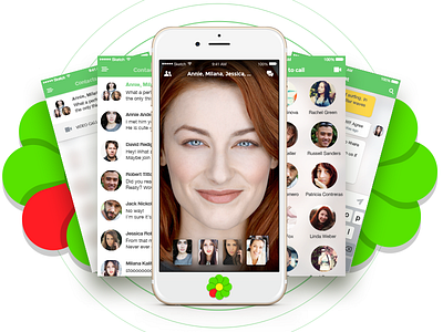
ICQ app redesign concept
It's really hard to be the first but I'll start this game!
All competitors wait to start real competition — so let's go on!
I had a lot of ideas about this app and today just want to share one of them.
Main features:
— minimum screens (contact/chats list, video call screen, chat screen, add contacts to chat)
— fast and simple swipe navigation in app
— stack decision for video call with many people
— translucent or custom backgrounds
— many other small improvements
Some flows need improvements and discussion but the main idea is shared.
I wanted to show full animation but dribbble cut number and weight of files so I attached just few main animations.
Enjoy! And fight! =)
P.S.
Maybe I'll get some special prize "Brave Heart" because I'm the first who posts the rebound =)


