Pathlab™ - Logo & Branding for Logistic Company - Letter P Arrow
This is the 3rd Logo and brand identity design project I've done at July 2024 for a Logistic company name "Pathlab™ "!
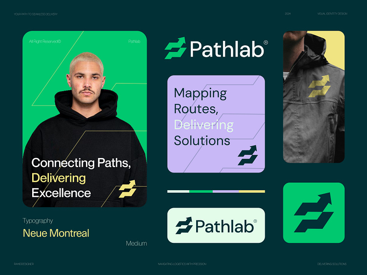
Pathlab™ is a logistics company dedicated to ensuring your packages reach their destination safely and on time.
Concept: Letter P + Arrow (Letter P from the brand name initial and Arrow indicate moving, delivering, speed, logistic brand)
Color Psychology: Yellow represents speed and efficiency, showing PathLab's commitment to fast deliveries. Green symbolizes sustainability, highlighting our eco-friendly practices. Purple stands for reliability and innovation, reflecting PathLab's dedication to dependable and cutting-edge logistics solutions.
Press "L" to show your love ❤️️
____________________________________________________________________
👉 Let's work together and elevate your brand!
📩 Available for new projects :
Email: info@rahidrehman.me
WhatsApp: https://wa.me/+8801705553455
Telegram: @rahiddesigner
💡 Follow for more update: Dribbble, Behance, Instagram, Twitter, Linkedin
© Rahid Rehman