KENDRA | LOGO & BRAND
Kendra [Logo and Branding Project]
🟢 Logo | Branding | Brand Identity
🟢 Field: Flower shop
🎨 Kendra wishes to design a logo: Creative, sophisticated
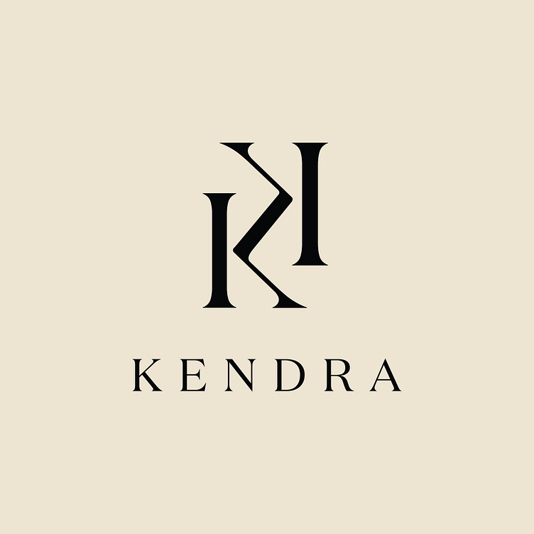
🎨 Kendra flower shop always wants to bring customers joy and happiness through the diversity and quality of each product. Therefore, Kaiza came up with the idea of designing the Kendra flower shop logo with the symbol being the creative integration of the letters in the brand name. The logo uses symmetrical contrast elements to create a sense of balance and harmony, making the logo easy to see, easy to remember and create a pleasant feeling for viewers. The symmetrical element also helps the brand convey the salon's message that it will always accompany customers no matter what event. At a glance, the logo is designed to resemble a bridge connecting the brand and customers.
The brand font used by Kaiza is an elegant, clear serif font that gives the logo a sophisticated feel. Black was chosen by Kaiza as the main color for the logo, demonstrating the premium quality of flower products as well as adding sophistication and simplicity, creating a luxurious feeling for the logo.
Designed by Kaiza
Copyright © Kaiza. All Right Reserved
Contact us:
KAIZA CO.,LTD
• P: 0889 996 399
• E: info@kaiza.vn
• W: www.kaiza.vn
Connect me @ Behance - Instagram - Pinterest


