Mailbox app > Spark app

After Mailbox shut down a few months ago, I was on a hunt to find a new mail app. Readdle's Spark has been my new go to. It has the old gestures and the snooze function just like Mailbox, but my main gripe is the screen you see when you snooze a piece of mail.
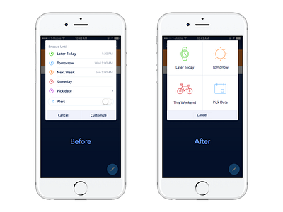
If you defer mail frequently like me, this is a screen that you see. A lot. So much so that I usually have a pattern of when I want my email notified again. The screen on the left is too cluttered and has options that could be changed in the app settings rather than at a decision point. I would much rather have different icons in a 4x4 quadrant to make my workflow simpler, inspired by Mailbox.
Shout out to @surabaya for the superb icons.