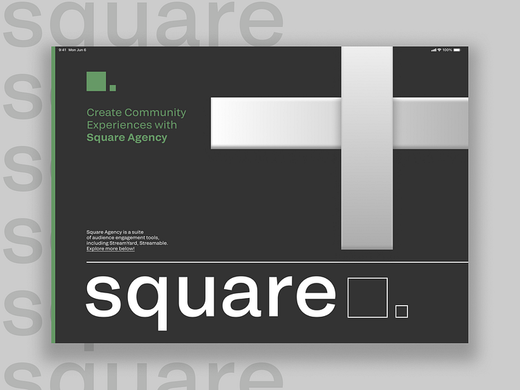
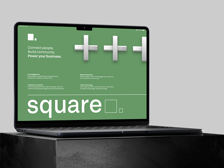
The concept of a landing page for Square Agency
Connect people.
Build community.
Power your business.
Connecting people is the heart of Square Agency. All of our products bring people together around experiences. The company's website provides a reliable platform where people can come together and make this world a better place. That is why the design is based on the principle of Swiss typography — it allows you to make the site concise and understandable for any user.
A square is a form of order. This figure symbolizes stability.
The shot displays:
🤍 the main landing page screen
🤍 the screen with company values
🤍 the screen illustrating these values, using the example of user photos
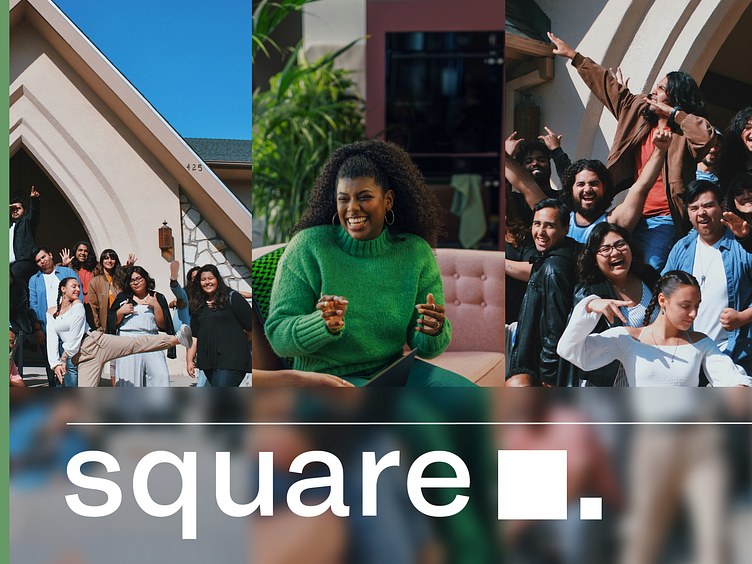
A square is a form of order. This figure symbolizes stability. Calm colors and concise font are associated with stability and choosing the right solution. On the contrary, there are vivid photographs illustrating the company's values.
