E-learning Educational Dashboard Design | Web App
Overview
The Focotech dashboard design aims to provide users with a seamless and engaging learning experience. The clean, modern UI combined with intuitive navigation ensures users can easily access their learning resources and track their progress.
Design Visuals:
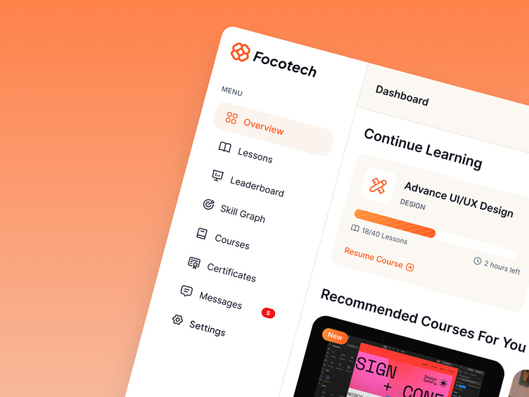
Color Scheme: The dashboard uses a warm, inviting color palette dominated by shades of orange, which creates a lively and energetic learning environment.
Typography: Clear and readable fonts are used throughout the interface, ensuring information is easily digestible. The hierarchy is maintained with bold titles and smaller body text.
Icons and Imagery: Custom icons and high-quality images add to the visual appeal and enhance the overall user experience. The use of avatars and profile pictures adds a personal touch.
UX Elements:
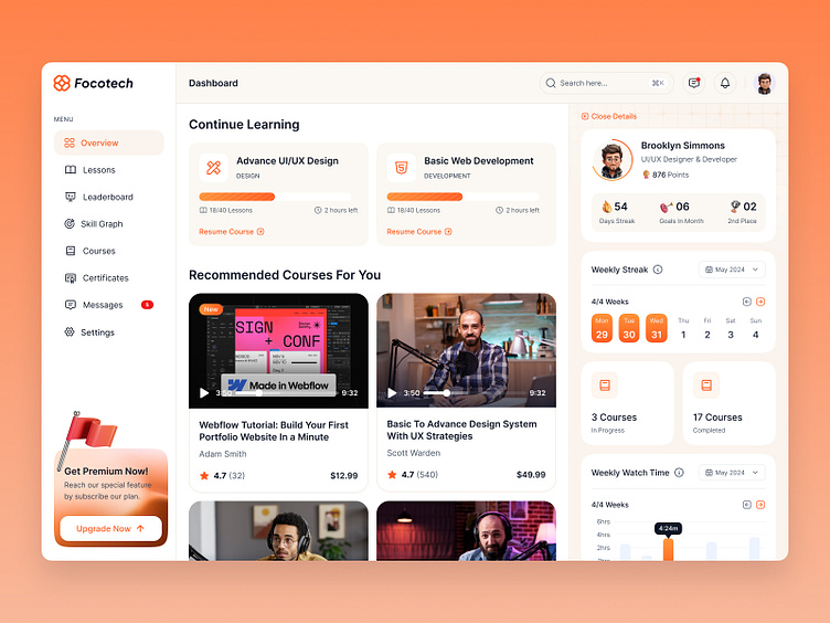
Navigation Menu: The left sidebar provides easy access to key sections such as Overview, Lessons, Leaderboard, Skill Graph, Courses, Certificates, Messages, and Settings. This organized layout helps users find what they need quickly.
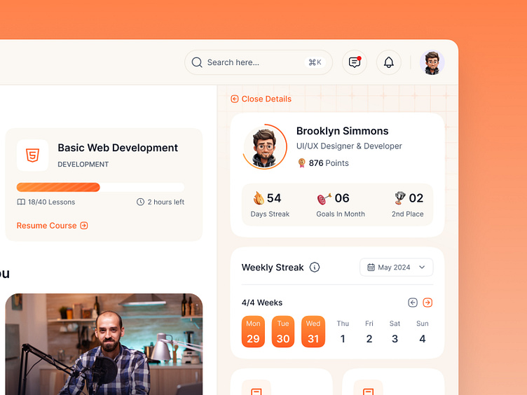
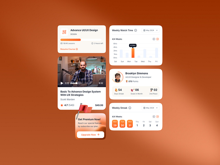
Continue Learning Section: This section prominently displays the user's ongoing courses with progress bars, making it easy to resume where they left off.
Recommended Courses: Personalized recommendations based on the user's interests and past activity encourage further learning and exploration.
User Profile: The top right section showcases the user's profile with a snapshot of their achievements, including points, goals, and ranking. This gamification element motivates continued engagement.
Weekly Streak and Progress: Visual indicators of weekly activity and course completion provide a clear overview of the user's learning habits and achievements.
Premium Upgrade CTA: A strategically placed call-to-action for upgrading to a premium plan stands out, inviting users to access additional features and benefits.
Copywriting:
Clear and Engaging: The copy throughout the dashboard is concise and engaging, guiding users through their learning journey. For example, "Get Premium Now! Reach our special feature by subscribing to our plan" is a compelling CTA that highlights the benefits of upgrading.
Personalized Messages: The dashboard uses personalized messages such as "Recommended Courses For You" to create a more tailored experience.
Motivational Elements: Gamified elements like "Days Streak," "Goals in Month," and "Leaderboard" entries keep users motivated and engaged.
Contact us
focotik.agency@gmail.com
