UI/UX App Design Case Study websiye
I decided to start learning UI/UX on December 26th. I never imagined I would get this far in a little over a month of studying. I woke up 2 hours earlier than I usually would every single day to study and absorb all the knowledge I could.
I'm not one to dip my toes in the water, I jump in headfirst. The first step on my UI/UX journey? A case study.
When I approached the idea of creating my first UI/UX case study, I knew it had to be something that I resonate with, an app that I could see myself and others using day-to-day but is currently lacking in the product space.
Key Takeaways:
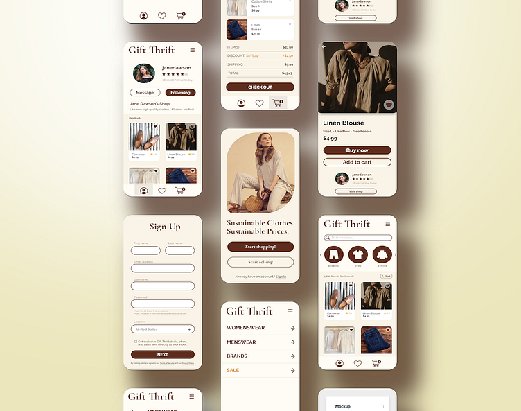
• Easy on the eyes: I used warm tans and soft browns to make the user-experience pleasant and prevent eye-fatigue over time. No one wants to stare at a stark white screen for hours.
• Everything within easy reach: All of the most important buttons and navigation is placed strategically within easy reach of your thumbs while using the app.
• Individual shops: When you find a seller in your size and style, you can buy many of their items. It's like a style collection curated perfectly to your style.
• Emphasis on spacing and font size: Everything is equally spaced with generous padding to allow for an easy user experience. You need to know where to look, so the most important headings are prioritized in bigger font sizes and bolded.


