Grid System - UI/UX
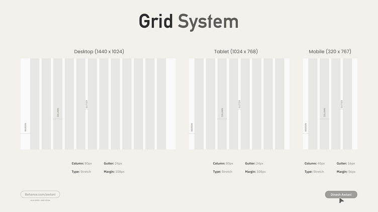
Hey UI/UX Designers, if setting proper dimensions and grids for your website designs is proving to be a challenge, you're not alone. A well-structured grid system is crucial for achieving a cohesive and visually appealing layout. To help you master this, I've put together a comprehensive example of how to set up a grid system for your next website design project.
This guide will cover:
Choosing the Right Grid Type: Understand the differences between fixed, fluid, and responsive grids, and when to use each.
Defining Column and Gutter Widths: Learn how to determine the optimal column and gutter sizes for your layout.
Establishing Consistent Margins: Tips on maintaining equal margins to ensure balance across your design.
Aligning Content Precisely: Techniques for aligning text, images, and other elements within the grid.
Using Grid Systems in Design Tools: Practical advice on setting up grids in popular design tools like Adobe XD, Figma, and Sketch.
By following this example, you'll be able to create grid systems that enhance the usability and aesthetic quality of your website designs. Say goodbye to inconsistencies and hello to polished, professional layouts!