Food Delivery App Brand design - Bento
Bento is a platform, in development, which directly brings together cooking enthusiasts from every corner with their neighbors in search of circulating dishes. The platform aims to offer an authentic, personalized and affordable culinary experience by ordering tailor-made dishes and interacting directly with the chefs.
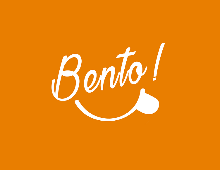
The Bento logo consists of the label "Bento!", with the exclamation mark "!" at the end to amplify the expression of delight conveyed by the smiling mouth symbol, with the tongue at the top corner.
Bento comes from Japanese culture. It's a concept that represents small baskets of tasty food, usually prepared with great care.
Our aim is to represent the project's vision of enabling people to enjoy meals cooked with care by their neighbors, packaged with care and delivered to their doorstep.
Design psychology
The Bento product mainly targets relatively young men who live alone, reside in urban areas and are mostly freelance or tech workers. This is a population with a geek culture, a fan of japanime culture. The choice of label resonates with a world they know well.
The Bento logo is designed to express the spontaneous joy of enjoying a good meal.
Accessibility
The brand is designed to fit perfectly on dark and light backgrounds, a key factor for an application forecasting to include light and dark themes. We defined style for dark colors background
Typography & color
The typography is a handwriting font in an italic style. We chose it because the brand wants to communicate a spirit of spontaneity, joy and authenticity.
We preferred the dark orange color to embody a fiery personality, common to the most sympathetic heroes of Japanese anime (Goku, Naruto, Rengoku, etc.)


