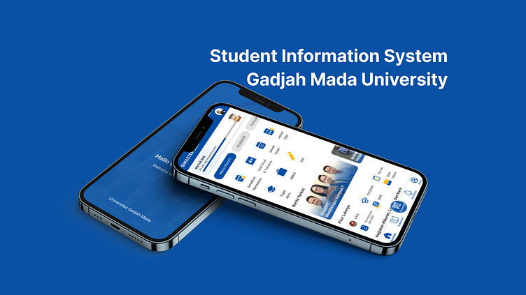
Student Information System UI/UX Research and Design
2023 University Project. This project analyzes the student information system of one of the universities in Indonesia. There were 664 participants who filled out quantitative and qualitative questionnaires on the needs and problems of the current mobile app interface, the results of which were analyzed and represented as a mobile app redesign. Then, I also conducted usability testing with A/B tetsing, Eye Tracking, and Retrospective think aloud evaluation to get results that suit users.
The steps
The first strategy I did was to take data from both quantitative and qualitative questionnaires. The quantitative results will be tested using Friedman statistics to find features with low comprehension rates. Meanwhile, the qualitative results of suggestions and constraints will be categorized by sentiment analysis.
After that, I take 5 participants randomly to do usability tetsing the system interface that is currently in the lowest comprehension feature section, and take qualitative data with in depth interviews.
After concluding, I created user personas that describe the needs and problems of the participants.
scope is a step to limit what parts will be evaluated in the redesign.
Interface Arch
In the structure I designed the interface architecture with the open card sorting method. There were 15 people who used fig jam as a sorting mode freely by creating their own feature group names. After all of them grouped I made a feature group conclusion with the help of scipy.cluster.hierarchy.linkage coding.
After the design is finished, the next step is to create a wireframe, which is with low fidelity.
I created two interface options that will be subjected to A/B testing. This test will result in which interface has more effectiveness than the other interface.
Eye tracking 👁️👁️
The selected interface is interface A. The next step is testing with ux metrics that have a high level of accuracy. This test is eye tracking. participants will be tested for features with a low level of understanding between the current interface and the redesigned interface (interface A) with an Area of interest (AOI) that has been determined by the researcher. The results will show the fixation and duration of the eye in searching for the feature. So I get quantitative data that will be processed using statistics to see which is more effective the current design or redesign.
Final Result
Done. more efficient time won by redesign 🤗
Get in touch,
email me imankavi@gmail.com


