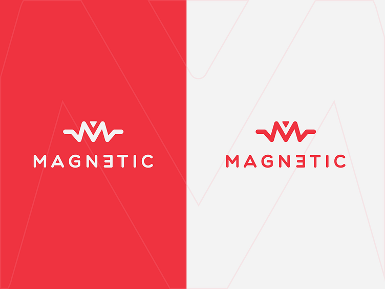
Magnetic Band Logotype

About Magnetic band
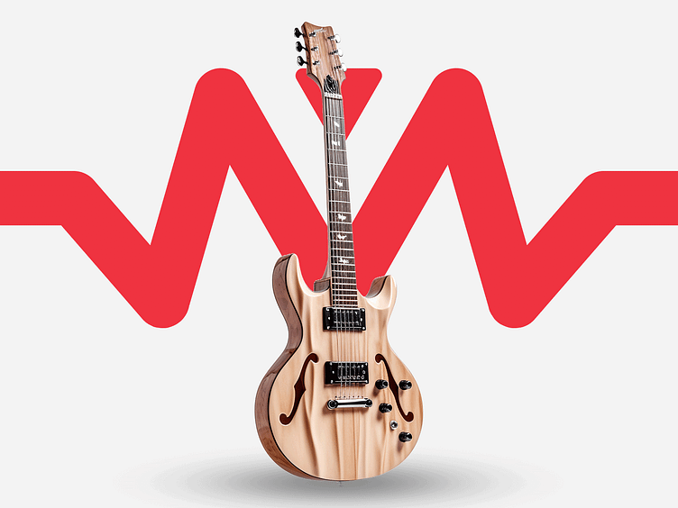
The Magnetic Band captures the essence of what it means to play music from the heart. Their tunes aren't just heard; they're felt, woven with strands of love and a touch of elegance that only true professionals can bring to the stage.
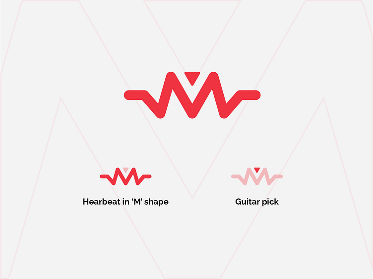
Logo Mark
A logo represents the essence of the Magnetic Band, merging the rhythmic pulse of a heartbeat with the letter 'M' to symbolize the vibrant energy of their music.
This design is accentuated by the silhouette of a guitar pick above the 'M', a nod to the craftsmanship and precision that goes into every strum and chord.
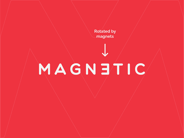
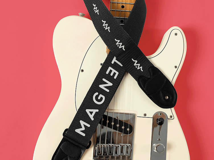
Magnetic Pull
The mirrored 'E' symbolizes the magnetic forces, reflecting the band's name and the powerful pull of their music.