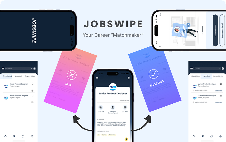
Jobswipe: Your Career "Matchmaker"

This case study explains how I designed a job search app with a “swipe” feature and personalized user experience.
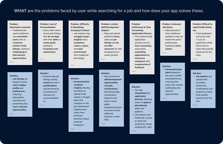
Job search is a journey that is very confusing, tiring, and exhausting. It's like solving a tricky puzzle. Finding the right job, applying for it, filling up the application, and writing the cover letters, is a long process.
So in the dynamic job market, JOB Swipe aimed to personalize and revolutionize the way individuals discover and apply for jobs with the “SWIPE” feature.
Understanding the Problem Statement:
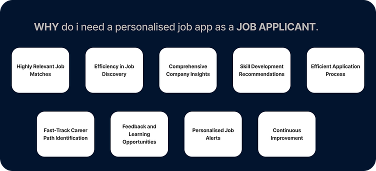
We live in a world where every experience is highly personalized, so why should job search be any different? How about we personalize this also? But HOW?🤔
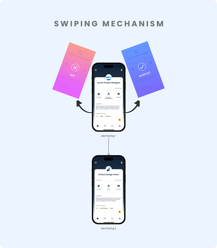
Have you ever thought about what it would be like to search for a job on apps like Tinder, bumble, hinge, etc. with a single swipe? You can look at the job listings and find the perfect job opportunity whether it’s about learning new skills, joining an inclusive workplace, seeking mentorship, pursuing a fast-track career, finding a place to hustle, or maintaining flexibility in your work life.
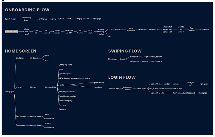
Mapping the User Experience
After figuring out the potential features and flows needed for this experience, I dived into FigJam, carefully creating a mind map through several revisions. I decided to work on two major flows for this app:
Onboarding flow
Swipe flow (job search flow)
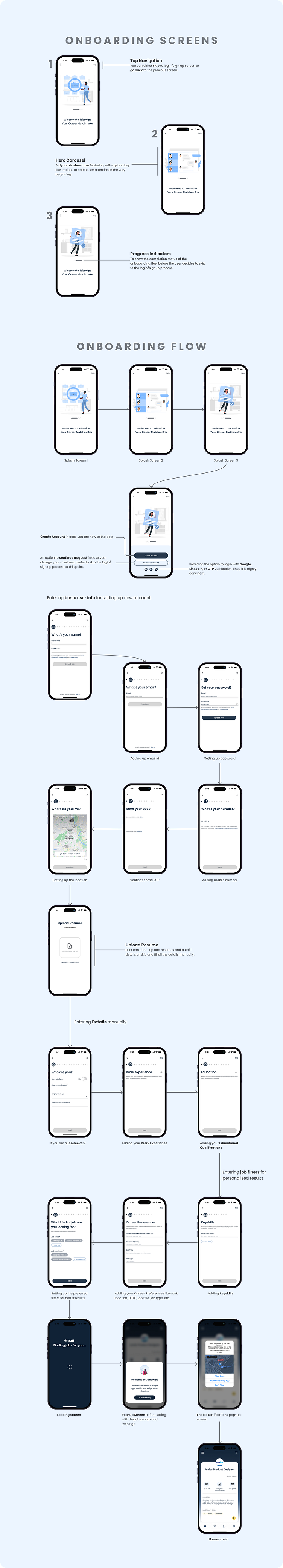
Let’s proceed to the exciting stage of getting ready for the visuals! I looked through many apps observing colors and patterns to get ideas for creating a useful yet professional-looking app.
Takeaways & Learnings
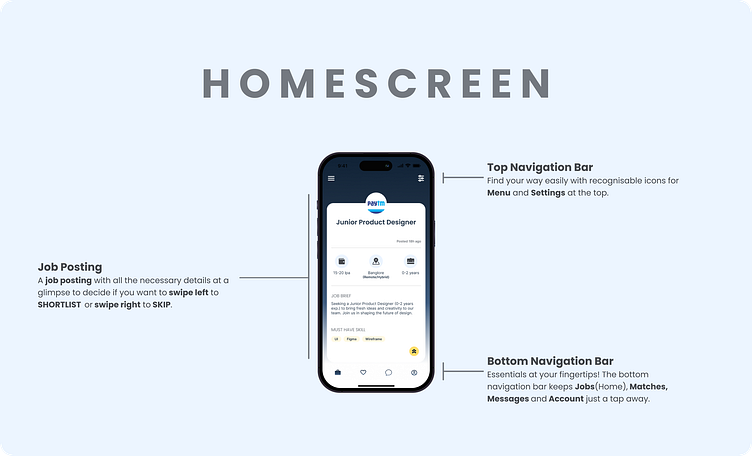
Always keeping the primary goal of helping users find the right job, it’s important to avoid excessive content from the screen that can hinder clarity.
Keep iterating be it visual design, topic selection, or card information architecture.
“What you consume is what you create”. I had to refer to many mobile apps (job hunt and dating apps) to understand the flows, screens and moodboarding to get the visual direction in mind.
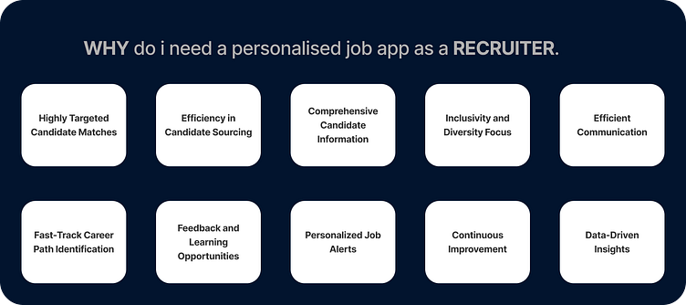
As a part of the assignment, I designed the app specifically for job seekers. My target users included both job seekers and hiring managers. I will also design for the other group of users.
I recognize room for improvement in the problem-solving and visual aspects of the project.
That’s a Wrap!
Thank you for taking the time to explore this case study. I hope you found it as enjoyable to explore as it was for me to create.💟
Your feedback matters! Feel free to jump into the comments and share your thoughts. I would be grateful to listen to your suggestions and pave my road to becoming a better designer, and I’m eager to continue the conversation.🤝
Ready for fresh opportunities! If you’re shaping a dynamic design team and sense a potential fit, let’s connect on LinkedIn or Twitter. Link to my Portfolio. I’m keen to contribute to impactful design teams.✨