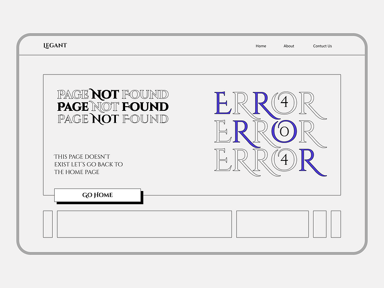
404 Page - Daily UI #008
🚀 Daily UI Challenge #008: 404 Page Design
I'm excited to share my latest design for the Daily UI Challenge! This time, I tackled the infamous 404 Page.
🔍 Concept: The design embraces a minimalist aesthetic with clean lines and a clear message. I aimed to make the error page not just informative but also visually engaging.
🔗 Details:
Typography: Used a mix of bold and elegant fonts to highlight the error message.
Navigation: Included a prominent "Go Home" button to help users quickly navigate back.
Aesthetics: Kept it simple and modern, aligning with the overall design language of the website.
What do you think? Feedback and suggestions are always welcome! 😊
---------------------------------------------------------------------------------------------------------
Let's talk and Collaborate:


