CHỢ TA | LOGO & BRAND
Chợ Ta [Logo and Branding Project]
🟢 Logo | Branding | Brand Identity
🟢 Field: Clean food
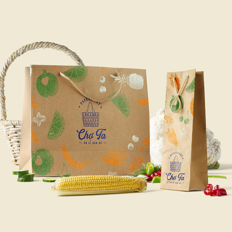
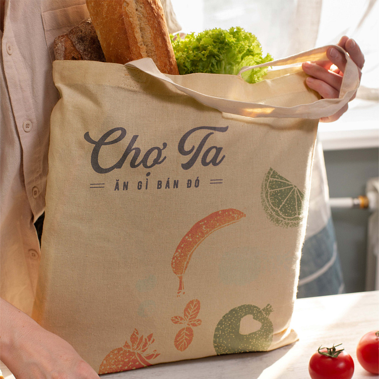
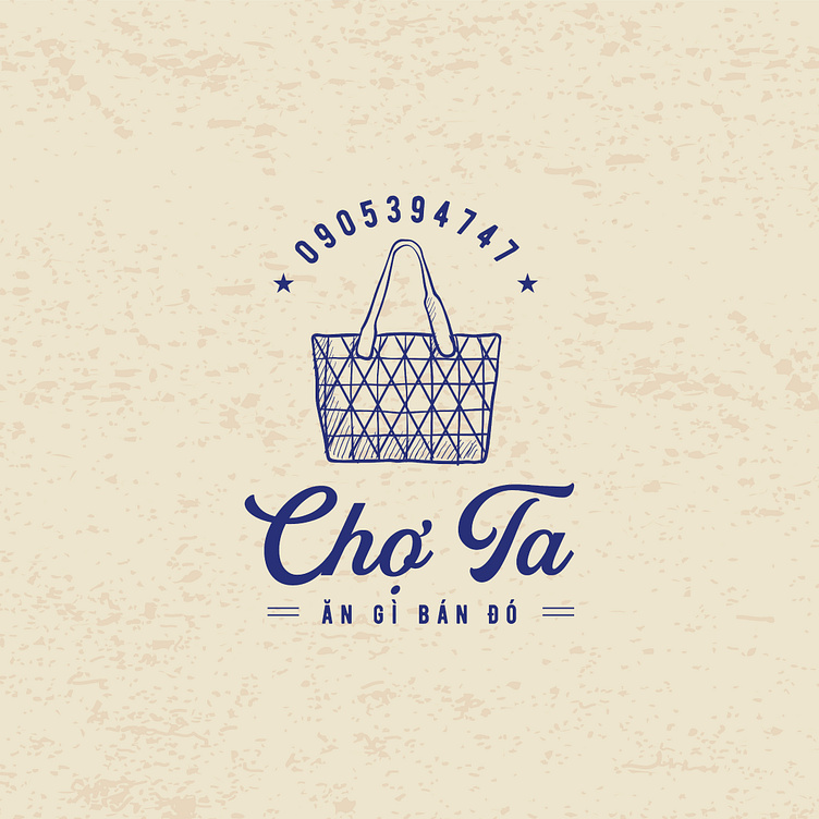
🎨 Cho Ta wants to design a logo: Has an image of a basket
🎨 Cho Ta is a clean food business brand with the mission of providing consumers with clean, safe and high quality food products. Kaiza used the image of a handbag as the main image in the Cho Ta logo design. The image of a basket is often associated with intimacy because this is an item that has been used by our grandparents to carry food for a long time, it is an important part of daily life and represents a lifestyle. healthy. In addition, the image of the handbag also represents environmental protection, creating a statement about the brand's sustainability and social responsibility towards the environment.
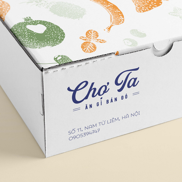
The brand font is creatively stylized by Kaiza, along with the slogan "What you eat is what you sell" combined with dark blue to create an overall logo that is simple, creative but still represents the brand's mission.
Designed by Kaiza
Copyright © Kaiza. All Right Reserved
Contact us:
KAIZA CO.,LTD
• P: 0889 996 399
• E: info@kaiza.vn
• W: www.kaiza.vn
Connect me @ Behance - Instagram - Pinterest