Galleries - Art Gallery Booking Mobile App
App Overview
The Galleries mobile app connects art gallery enthusiasts with nearby exhibits. Many art galleries were affected by Covid-19 and now require online reservations. Some have created virtual tours that users can view at home. Galleries takes advantage of these changes and provides an intuitive app for anyone looking to attend an art gallery.
The Lockdown Problem
Covid-19 forced art galleries to move online when venues had to close their doors to the public. Many art galleries created innovative virtual tours to bring in visitors while their country was in lockdown. Other galleries created online booking systems that require users to book time slots for entry. The Galleries app capitalizes on this new online space and gives users a consistent online space to interact with art galleries.
Galleries Goal
As museums began to shift from in-person tickets to online reservations, they updated their websites with online booking systems. This resulted in unintuitive booking processes. The Galleries app simplifies the online booking process and provides a standardized way for users to attend their favorite art galleries.
User Research
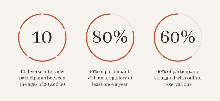
I started the project by outlining my research goals and determining the best way to empathize with users. Interviews appeared to be the best method for learning about user expectations and habits in this pre-established market. After conducting ten interviews, I was ready to create personas that represent the needs of potential users. I consolidated the research findings into empathy maps which helped determine the pain points labeled below.
Complex
Art Galleries and Museums have convoluted booking systems
Goup Tours
Many galleries require attendees to book their own tickets, which can make coordinating difficult for large groups
Artists
It can be challenging to learn more about artists in art galleries
Filtering
It's time consuming to search through art galleries and find one that fits your interests
Personas
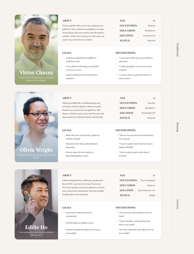
The personas helped represent the primary user demographics. The users were traditional art gallery attendees looking to share their passion for art and learn about local artists. Galleries would aim to satisfy the wants and needs of these users in the existing art gallery market.
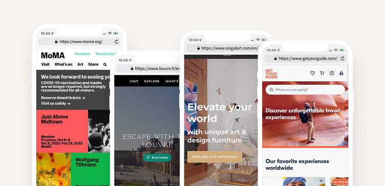
Competitive Audit
I compared the layout, content, target audiences, and checkout processes of 4 competitor websites. The MOMA and Louvre are direct competitors that offer gallery tours to a similar audience. Singulart is an indirect competitor that displays art for purchasing, and GetYourGuide provides tours to a broader audience. These competitors helped offer insights and standards to consider in future designs.
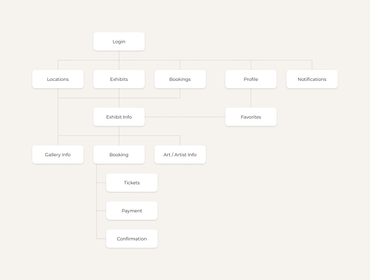
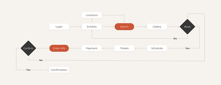
Information Architecture
The mobile app structure includes multiple high-level entry points for users that funnel toward booking an art gallery tour. This layout provides users with several options to complete their goals. Users can filter through exhibits in their preferred method to find one that suits their needs.
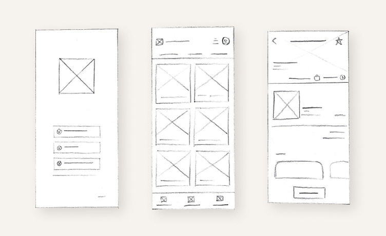
Paper Wireframes
After creating a sitemap, I drafted several paper wireframes for each screen to test several navigational elements. I eventually gravitated towards a pinned menu at the bottom of the app for the main pages and a back arrow at the top left for the booking and informational screens.
Usability Study
I created a research plan and recruited 5 participants for an unmoderated usability study with a low-fidelity prototype. Participants recorded their progress as they booked an art gallery tour and navigated the app. The users also scored the app using a system usability scale. The study helped me understand where users had trouble with the app and how users felt about the booking process. I took notes on the recordings and compiled them in an affinity diagram to determine study insights.
Study Insight #1
The "Book Tour" button is low contrast and inconveniently located
Study Insight #2
The profile icon does not stand out as a clickable button
Study Insight #3
The payment process is confusing and needs a confirmation
Study Insight #4
Users would benefit from a clear, intuitive filter present when browsing exhibits
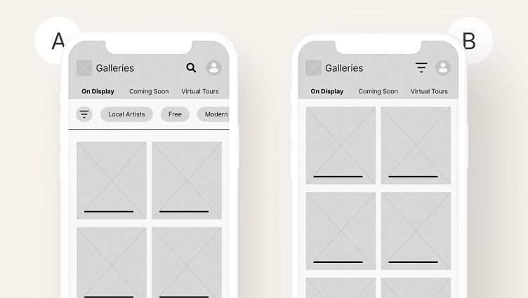
A/B Testing
I used A/B Testing to determine if the design changes made using the study were productive. I showed each participant a side-by-side comparison of wireframes and prototypes focused on problematic interactions. I asked the participants to choose their preferred option and explain why. This testing helped confirm that my solutions were addressing user pain points.
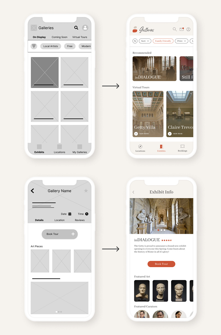
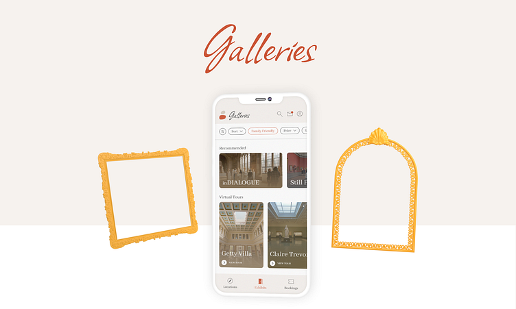
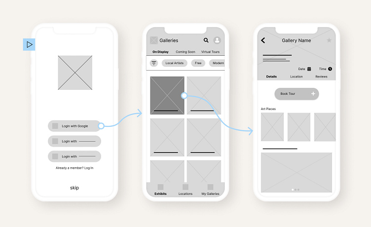
Mockups
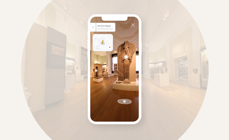
As I was transitioning from digital wireframes to mockups, I emphasized images over text to allow the user to see glimpses of the galleries. This design philosophy allowed me to simplify designs and shrink elements across the screens to ensure that the images were the largest subjects on each page.
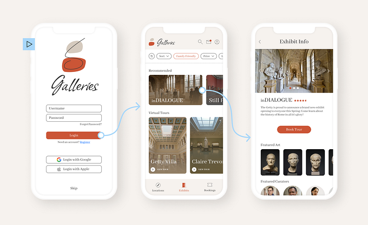
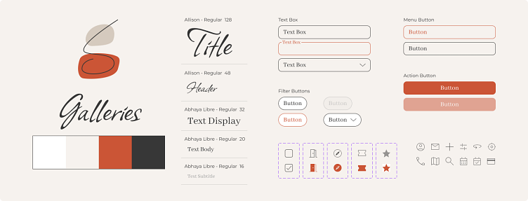
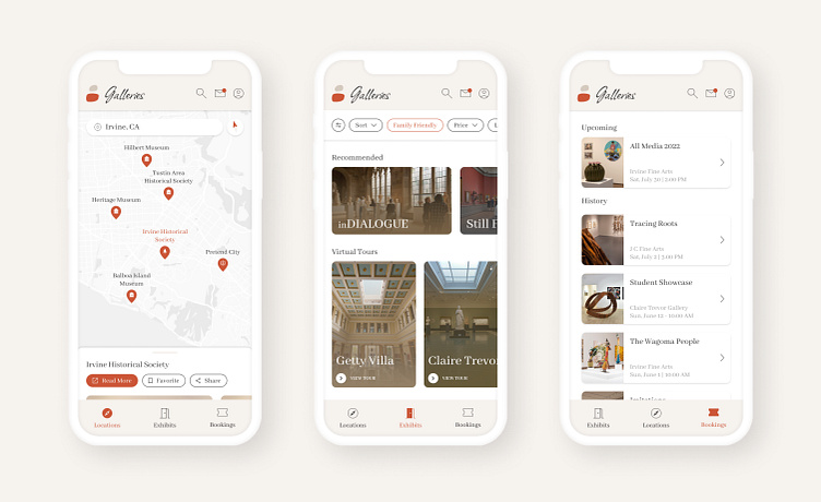
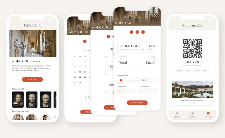
High-Fidelity Prototype
I consolidated the app's visual foundation to maintain consistency within the app's design. The high-fidelity prototype utilizes typography, colors, buttons, forms, and icons to create a cohesive theme that improves navigation and readability. This final prototype builds upon research and study insights to address user pain points.