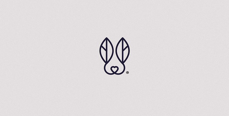
Conejo Blanco - Logo design
The design of the isotype was based on the combination of tea leaves alluding to the product and nature, the head of a rabbit that directly refers to the name and a heart that reflects the love for tea. The brand is modern, aimed at a young audience, so simplicity in the design was essential. This simplicity is complemented by a serif typography that gives it elegance.
More by Andres Vera View profile
Like


