20/32 – Chicago Dragons
Beasts of the East
We wrap up the Great Lakes Division with the Chicago Dragons, team number 20 for #theUFLProject!
The true juggernaut of the UFL, the Dragons are the winningest franchise in the league. Winners of 10 (yes, ten) UFL Championships and appearing in 11 – their last being a win over Los Angeles in Season 20 – this team was the unkillable monster of the Midwest. However, this team may have seen its reign of terror on the league come to an end. With an aging roster and just a few 9-7 Wild Card berths to show for since the big win 8 seasons ago, the Dragons' best years seem to be behind them as a rebuild looms on the horizon.
Visual Direction
This team holds a legacy unlike any other: it was the very first team created for this league back in 2005. The Dragons have seen many iterations (some of which are still around the internet) but the one constant has been the depiction of a double-blue snarling dragon.
Admittedly, the nickname was nebulous from the very beginning – there are no dragons in Chicago nor are there any obvious associations. However, there are some faint overlaps of interest.
Among many others, Chicago is widely known for its nickname as the "Windy City", and the lore of the Great Chicago Fire in 1871. Both associations, coincidentally, have confused origins – how the city got its nickname is lost to time and it isn't clear how the fire started back on that Sunday in October – it's almost mythological. There exists in Western cultures, however, a winged beast that roams the skies and has the capability of breathing fire – a dragon.
Execution
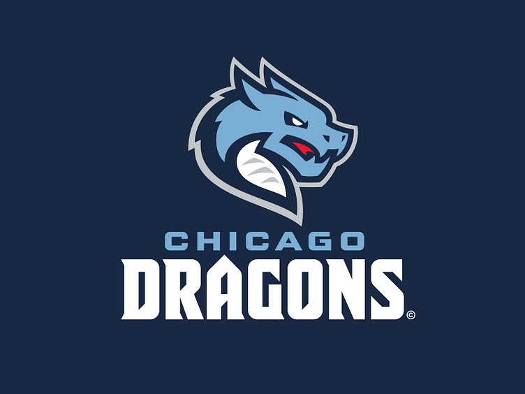
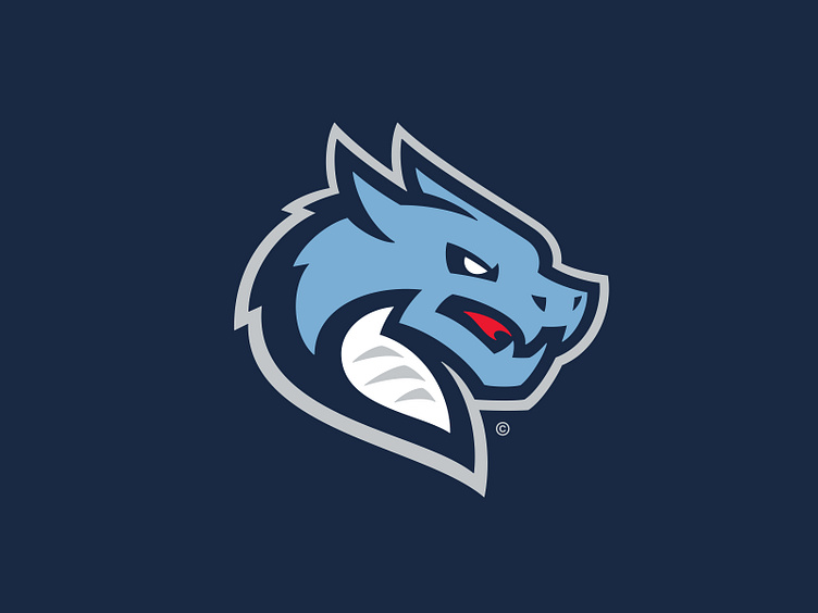
The primary logo for Chicago is a double-blue dragon illustrated in 3/4 perspective. Its physical attributes include two horns, a spiked backside, and a white underbelly. It has a snarling disposition as it opens its mouth just wide enough to see a flame begin to ignite.
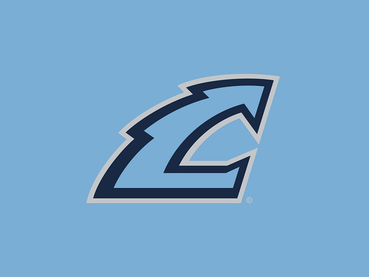
The secondary logo is a stylized "C", depicted with dragon-like characteristics including a jagged spine and an open-mouth design with the two terminals doubling as teeth.
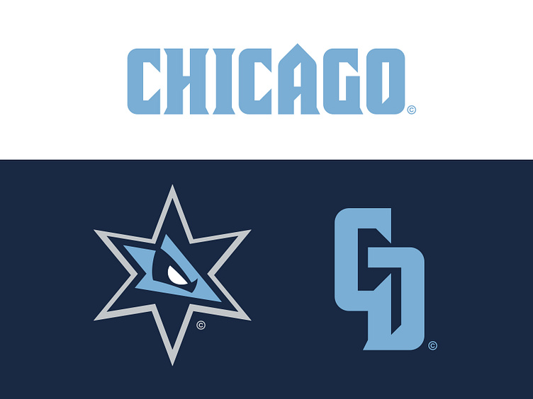
In the tertiary spot a single six-pointed star pulled from Chicago's flag. In this iteration, it serves as a window for a lurking beast just behind it – the eye of the dragon is drawn in the center.
An additional but seldom-used logo is a "CD" monogram that is designated for merchandise and inwards-facing media. The letterforms are built directly from the team's wordmarks.
The Dragons team typography at its core is a condensed square sans that draws inspiration from medieval blackletter design. It features diagonal framework, most prominent in the "A", "R", and "S" as well as the counters of other characters, that forms from a steady stroke. In addition, the "A", which is a shared letter between both "Chicago" and "Dragon" wordmarks, breaks the cap height and symbolizes the skyscrapers that dominate the city's skyline.
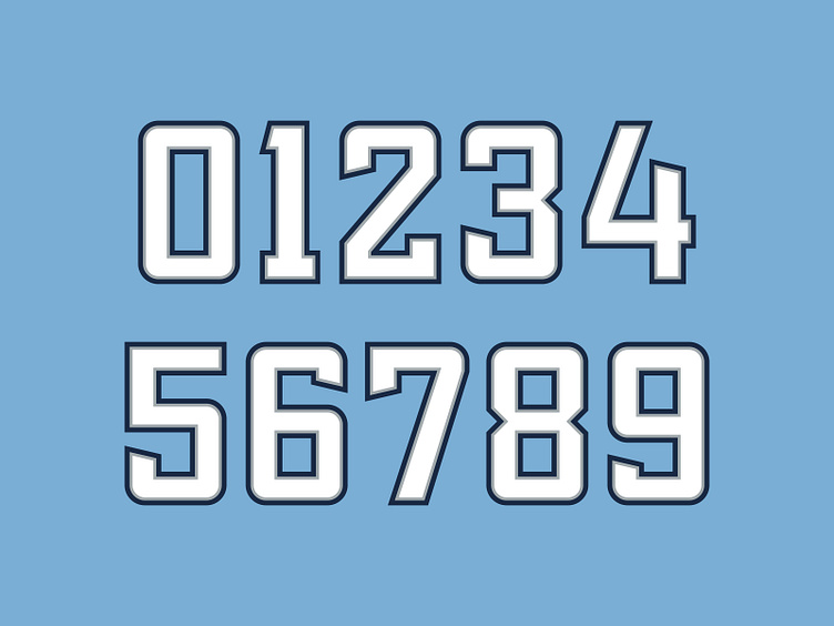
The jersey number set is a resurrection of a previously used design for the Dragons that was designed independent from the team typography. It's a rather cleanly built square sans with athletic block inspiration and angular terminals across many of the letterforms.
Fuel to the Fire
The Chicago Dragons, a storied franchise with rich championship-winning history, now has a reinvigorated brand identity with a mighty graphic suite as this team looks to recapture its fame of seasons past.
Football Helmet Mockup by SportsTemplates
____________________