Pluxee Flyer
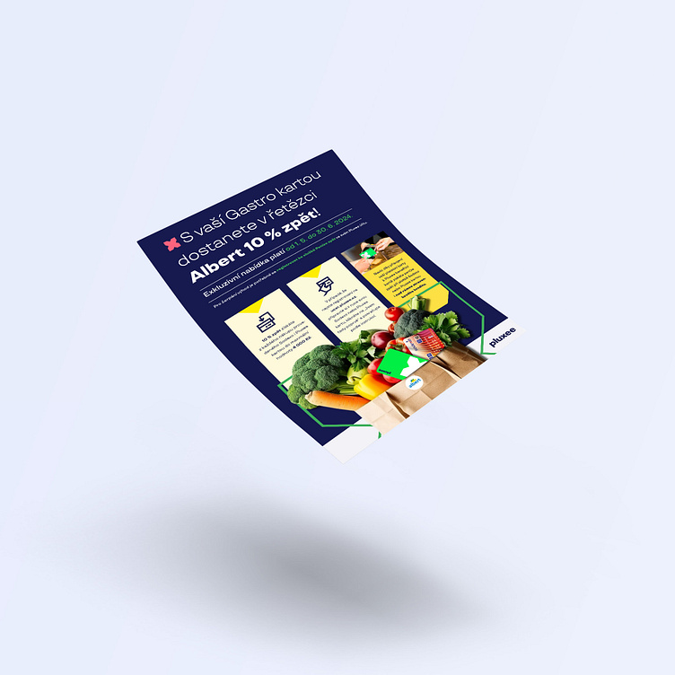
One of my recent projects involves designing a flyer for retail chains that informs customers about the opportunity to get back 10% of the amount they spend on their purchases. This flyer is crafted to clearly and attractively convey the message of this rewarding offer.
The dominant feature of this design is a large shopping bag, symbolizing the segment the flyer pertains to. This bag is prominently outlined with a large "X," a characteristic element of the Pluxee brand manual. This design ensures that the flyer is not only visually appealing but also easily recognizable to customers.
Additionally, the flyer includes both - the new Pluxee and the old Sodexo cards. This element ensures that customers quickly understand which cards they can use to take advantage of the offer.
