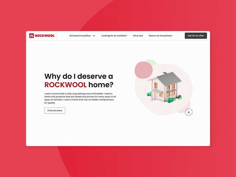
Case Study: Rockwool Website and Promotional Materials
Sector: Construction/Building Materials
My role: UX/UI Designer and Graphic Designer
Project Duration: Several months (including development)
Rockwool is a large, global company with an existing website filled with various categories of information, negatively impacting the user experience and resulting in declining sales. The "I deserve a Rockwool home" campaign aimed to address these issues by engaging customers in Eastern Europe, creating a more user-friendly and multilingual platform to provide comprehensive information about Rockwool stone wool insulation.
We set out to create a dedicated website for the "I deserve a Rockwool home" campaign, targeting individuals interested in home insulation. This site, covering multiple languages, serves both a presentation and educational purpose. It includes forms for customer support, sample orders of stone wool, and other inquiries. Alongside the website, visuals for social media, billboards, and city lights were developed to reach users through various communication channels. These deliverables aimed to improve user engagement and provide a cohesive brand experience.
As the UX/UI and graphic designer for this project, I was responsible for the complete design and execution of the website. This included conducting product discovery workshop, creating the information architecture, mood boards, wireframes, design systems, final design, and the handover to developers. I also worked on the promotional materials for the campaign, ensuring visual consistency across all platforms. Throughout the project, I collaborated closely with clients, the project manager, backend and frontend developers, and printing houses responsible for the promotional materials.
Product Discovery Workshop, Mood Board, Information Architecture, and Wireframes:
During the product discovery workshop, the clients presented their "I deserve a Rockwool home" campaign, their ideas, desires, and goals.
After this workshop, I created a mood board following the clients' instructions and brand guidelines. The initial mood board had a cold, corporate tone, but after discussing it with the clients, we decided to shift towards a warmer and friendlier direction to better align with the campaign’s focus on home insulation.
I incorporated dark red shades, added lighter tones, and included green to create visual dynamics. I ensured the color combinations were contrasting and readable. The friendly tone of voice was complemented by the Poppins sans-serif typeface with rounded contours and playful visuals matching the client's textual content.
Based on the content provided by the clients, I created the information architecture and wireframes to give the clients a better understanding of the future website structure.
UI Design for the Website:
Once the clients approved the wireframes and mood board, I incorporated them into the final UI design for desktop and mobile version of the website.
This process involved creating custom components and updating existing design system that included all components used on the website, a typographic scale, primary and secondary colors, support colors, favicon creation, open graph image creation, and implementing them into the application interface.
Additionally, I collaborated with developers to design animations for the website and its decorative elements and wrote a detailed handover file to help developers understand all design aspects.
Custom Icon Sets:
While designing the website, there was a need for creating two different icon sets to communicate specific information more effectively. I designed both sets in collaboration with the clients to maintain visual consistency with the Rockwool brand.
The first set of icons communicated various properties of Rockwool insulation, such as sustainability, sound insulation, fire resistance, durability and longevity. Examples of these icons are shown below.
The second set of icons was designed to clearly communicate different types of Rockwool insulation, such as roof insulation, facade insulation, internal wall insulation and floor insulation. These icons are used on the website in two color variants: green and red. Examples of these icons are also shown below.
Visuals for Online and Offline Campaign "I Deserve a Rockwool Home":
Alongside finalizing the website design, I worked on visuals for the "I Deserve a Rockwool home" campaign to ensure visual consistency with the website. I created visuals for social media, billboards, city lights, and taxis.
These visuals included the slogan “I deserve a Rockwool home” and variations of this phrase, along with photographs that visually represent the content of these phrases. Each visual was adapted to English, Croatian, Serbian, Bulgarian, and Romanian and prepared for printing in collaboration with various printing houses.
Overall, more than 100 visuals were created for this campaign in different languages, dimensions, and applications.
Conclusion:
The final product is a comprehensive, user-friendly web platform and an extensive set of promotional materials designed to enhance Rockwool’s engagement with customers in Eastern Europe. Screenshots showcase the clean and approachable design.
The new website and campaign materials have resulted in increased user engagement, with positive feedback highlighting the ease of accessing information and support. There was a notable increase in sample orders and inquiries about Rockwool products, indicating improved user interaction and interest.
Reflecting on this project, the primary challenge was shifting the visual tone from corporate to warm and friendly while maintaining brand consistency. This project taught me the importance of flexibility and effective communication in design. Moving forward, I plan to iterate on the design based on user feedback, further enhancing the user experience and expanding the platform’s capabilities to better serve Rockwool’s customers.


