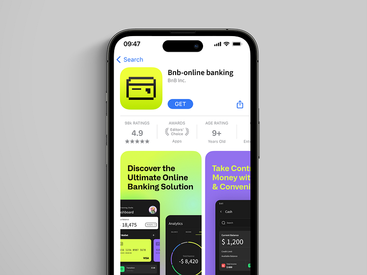
AppStore logo/icon (Bnb-online banking
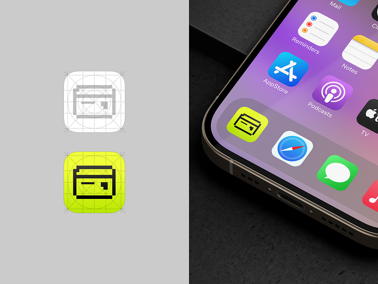
Hey everyone! I’m super excited to show you the new App Store icon for Bnb, latest online banking app design me and my mate worked on . I aimed for a design that’s not just eye-catching but also instantly tells you what the app is about.
Minimalist Look: I kept the design simple and clean with geometric shapes. The main graphic element represents the essential features of the app, like managing your money and making transactions.
Color Choices: The bright neon green background makes sure the icon stands out on any screen, while the black graphics are easy to read and hard to miss.
Structured Design: I used a precise grid to create balance and harmony in the icon. This structured approach isn’t just for looks – it also reflects the app’s reliability and precision.
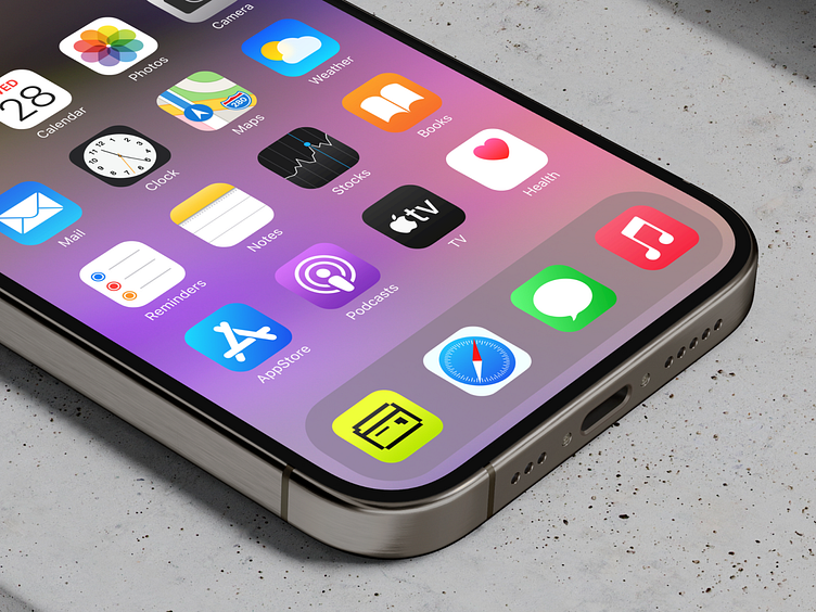
Versatility: No matter if you’re looking at it on a phone or a tablet, the icon stays clear and impactful, showcasing the app’s user-friendly and adaptable nature.
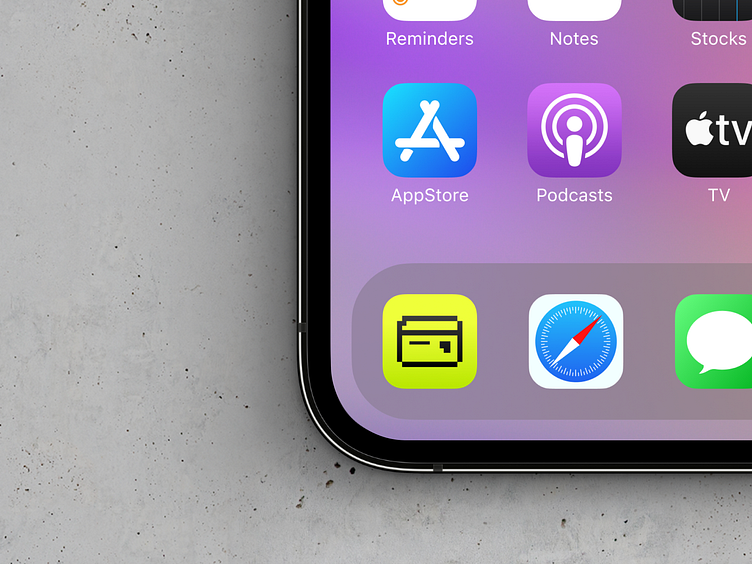
We’ve included both the raw grid version and how the icon looks on a modern smartphone home screen. This way, you can see the design process and how it fits seamlessly into the digital world.
Love to hear your thoughts! Your feedback means a lot. 😊