Identity WIP
Nice change of pace with some branding work.
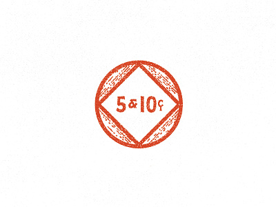
WIP logo mark for a restaurant (Five & Dime). The type style matches some of the original hand painted glass from the old general store that occupied the building in the early-mid 1900s.
Wanted the container to feel like a coin or a token, but also have some wood feeling to feel like a barrel of beer (the focus of this establish). Could see this coming together in a pattern, breaking up, etc. Lot's of stuff to figure out!
More by Drexler View profile
Like

