DUI #1: Log In Experiment
Daily UI: Sign Up & Log In
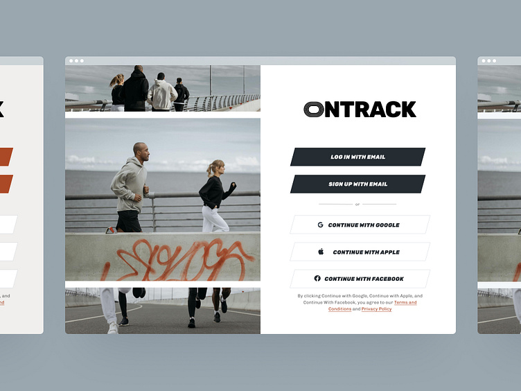
Sign up and login pages for OnTrack, a fitness platform for those that have fallen off from working out and want to get back and stay on track with the help of an active and supportive community.
Multiple login options using slanted buttons and italicized font for a sense of forward motion to represent the brand's mission to help members make progress towards their fitness goals. I designed the logo in the shape of a track field as a nod to the brand name and goal to help member stay on track. It also resonates with the platforms large community of runners.
OnTrack helps their community sustain lifelong changes, instead of allowing fitness to be just another thing on their to-do list. This requires focus and commitment from members towards their fitness and health goals.
I choose a calmer, gray/blue palette to represent a calm, but deep and intense state of focus. The "blue zone*".
*Also a term for places where people tend to live longer


