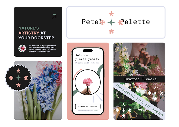
Petal Palette: Florist Branding and Application
Branding a florist store as 'Petal Palette,' the colors were initially inspired by carnations and herbs. The resulting logo showcases a variety of flowers, each imbued with hues that together form a vibrant palette. Opting for bold, dark colors enhances its distinctive appeal within the florist industry. Particularly, the addition of contrasting Raisin Black sets it apart, adding a unique touch to the theme.
This versatile logo serves not only as a visual identity but also as an illustrative element across applications. It plays a crucial role in fostering community engagement, facilitating easy access to floral offerings, and expanding business reach.
Feel free to reach me at:)
Pictures by Peter Bucks, Annie Spratt, Tanalee Youngblood on Unsplash


