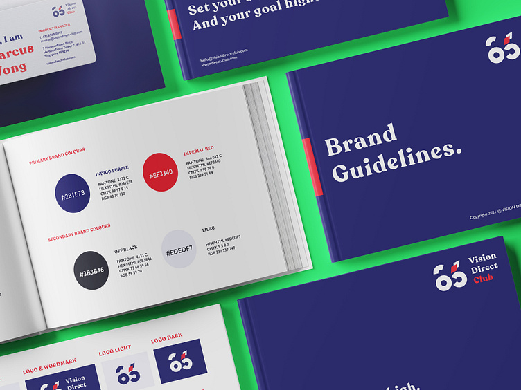
Brand Guidelines - Vision Direct Club, Singapore
Client: Vision Direct Club
Vision Direct Club, based in Singapore, stands as an innovative Online Eye Care Destination dedicated to meeting your vision needs anytime, anywhere. Their mission is to empower individuals to strive for higher goals by offering direct vision solutions that ensure they receive the highest quality of vision care.
Task: Logo Design and Brand Identity
Vision Direct Club partnered with me to develop a Logo and Brand Identity that would authentically reflect their youthful and dynamic brand ethos. They sought to disrupt the traditional eye care model by prioritising the online customer experience over brick-and-mortar shops.
Solution
In capturing Vision Direct Club's industry breakthrough, I crafted a bold and vibrant design to signify innovation and modernity, aligning perfectly with their forward-thinking approach.
For the logo, I symbolised perfect 6/6 vision—the standard for clear sight—by integrating a pair of eyes. This not only represents their core eye care service but also humanizes the brand, adding a touch of personality. Emphasising their 'online first' strategy, I incorporated two bold diamonds to symbolise directness, conveying the brand's commitment to providing streamlined services directly to consumers.
For the overall brand identity, we finalized the primary colors of indigo purple and imperial red—a bold and vibrant combination that symbolizes confidence and progressiveness. Our approach to typography and visual language was meticulous, ensuring readability across all media while evoking a youthful and contemporary vibe.
Crafting a story that resonates with your audience is essential for establishing a strong emotional connection.
I believe that every brand has a unique story to tell — one that can truly captivate and endear its customers. Let me help you create an exceptional brand experience that engages and delights your audience.
Contact me at ngocbtm2411@gmail.com to see how I can help your brand reach new heights.


