Minimizing Complexity: Clean HRM Dashboard Design
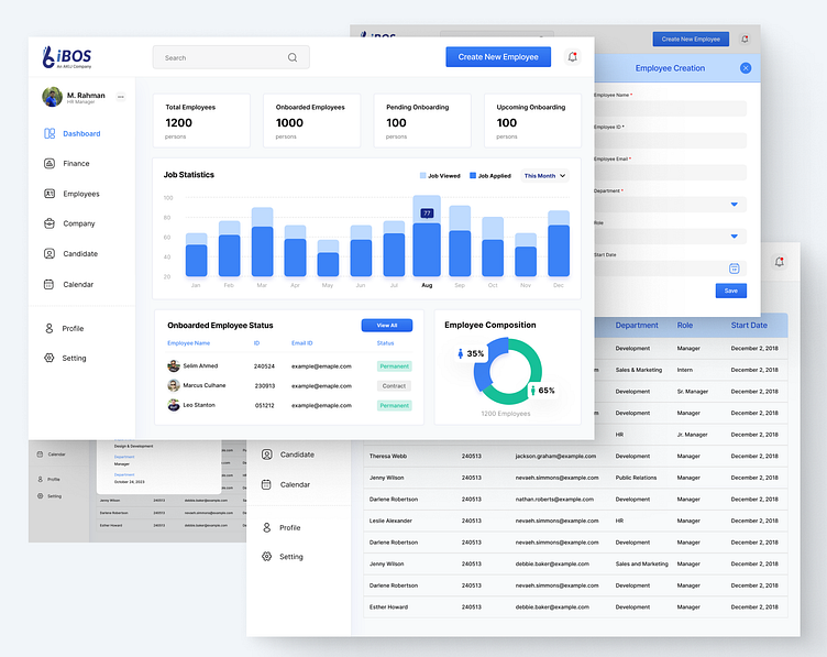
This HRM dashboard design prioritizes user experience with a clean, minimalist aesthetic. Key parameters are prominently displayed, while sections are structured based on client requirements.
Focus:
Intuitive Navigation: The dashboard layout minimizes the learning curve, allowing users to grasp the information and navigate efficiently.
Data Clarity: Information is presented in a clear and concise manner, focusing on the most important HR metrics.
Overall, this design aims to empower HR professionals with quick access to actionable insights.
Available for crafting your ideas...
📪 Email: adnan.nidal@gmail.com