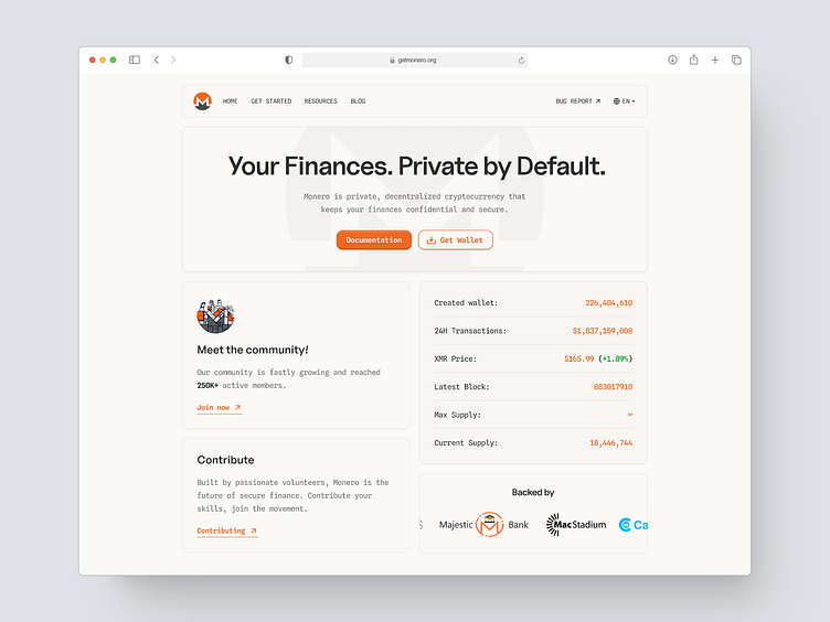
Monero (XMR) - Landing Page Redesign
Today I decided to create a design exploration of the Monero website. The current design looks simple, but I see a bit of a lack of focus on the user, what exactly is the main focus?
I redesigned the landing page, with a simple feel as well but with a little more modern touch, especially in the layout and placement of the CTA. The layout I applied a bento-style grid and divided it into two columns.
Here are the results of my exploration today, if there is any feedback and criticism, I will be happy to hear it. 😀
I've actually created a slightly different alternative layout, here are the results:
What do you think? I would love to receive your feedback.
Have a question?
If you have any questions about my design or any business inquiries, please feel free to contact me!
Email: wahibuix@gmail.com
Fiverr: https://www.fiverr.com/users/wahibirawan/
Upwork: https://www.upwork.com/freelancers/~01e5b6916736b074a0


