Case Study: MS Tim App
Sector: Health industry
My role: UX/UI design and graphic design
Project Duration: 1 year (divided into two phases, including development)
MS Tim is a mobile application designed for individuals with multiple sclerosis. The investor is the MS Tim Croatia association, and the goal of this app is to enable users to easily track and record symptoms, manage doctor appointments and medication schedules, store medical documents, and learn about multiple sclerosis.
The main and biggest challenge in creating this mobile application was addressing the diverse needs of users. Given that multiple sclerosis is a highly unpredictable disease, and each user has different capabilities and needs, it was crucial to provide various options for tracking symptoms and medication while ensuring accessibility. We achieved this by adding the ability to custom enter symptoms, skip certain questions within the symptom diary, and record audio notes instead of typing.
I worked on this project as a UX/UI designer from start to finish, responsible for updating existing design system, creating custom components, the entire app design, and conducting research. I used my graphic design skills to create accompanying promotional materials at the clients' request. Throughout the project, I collaborated with the project manager, backend and frontend developers, and directly communicated with the client.
Phase One:
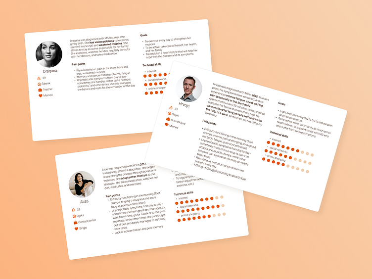
After the initial meeting with clients, I conducted research that included studying the disease and future users. Based on this information, user personas, information architecture, and wireframes were created.
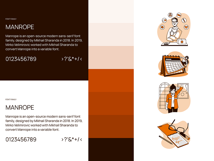
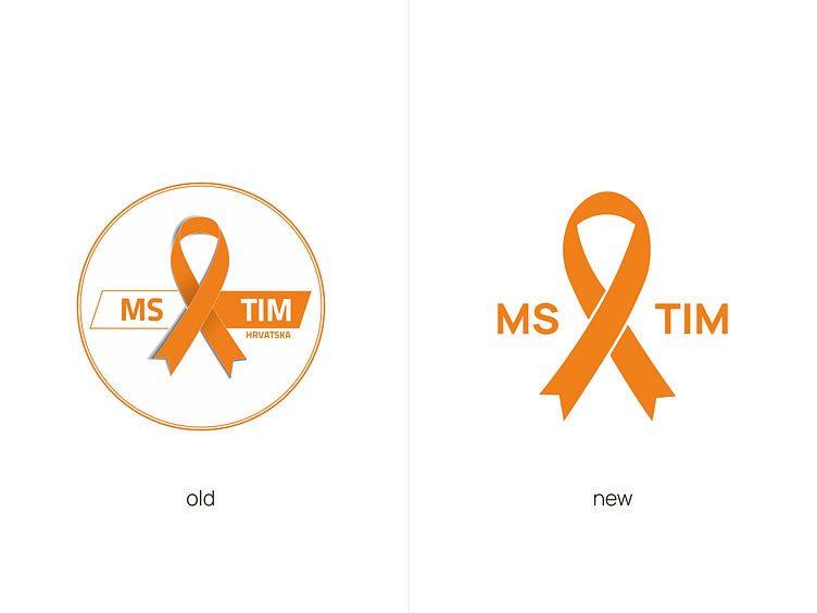
Simultaneously, I refreshed the MS Tim Croatia association’s logo to make it more suitable for use within the app interface and worked on the design system.
Due to poor contrast issues with the original orange color used in the branding, I darkened it slightly to ensure all critical information and interface elements were visible and legible. The original orange remains in the illustrations, incorporated to create a friendly and casual impression, distancing the app from traditional medical applications.
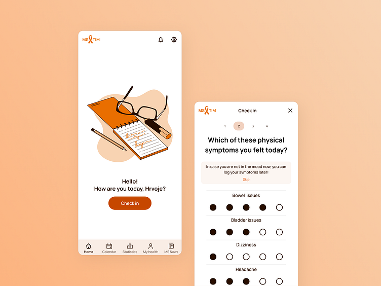
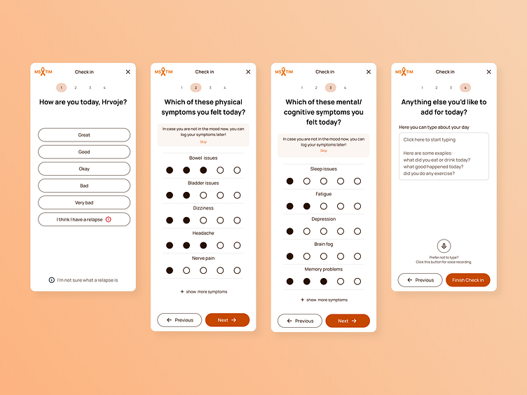
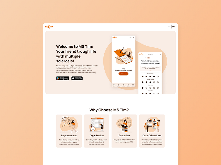
The MVP included a symptom diary, user profile with medical information, the ability to add medical documents, medication and appointment reminders, and a calendar feature.
The symptom diary, a key feature, allows users to track their disease progression daily. It includes various physical and cognitive symptoms that can be customized, and users can add text or audio notes.
This diary is essential for users to monitor their condition over time, providing flexibility to skip or complete steps later based on their capacity.
Phase Two:
Several months after launching the MVP on Google Play and the App Store, I conducted user research to identify opportunities for improving existing features and developing new ones.
This research was done through a Google Forms survey distributed via push notifications within the app. The analysis provided insights into user experiences, showing a need for additional options in setting medication reminders and how users filled out the symptom diary.
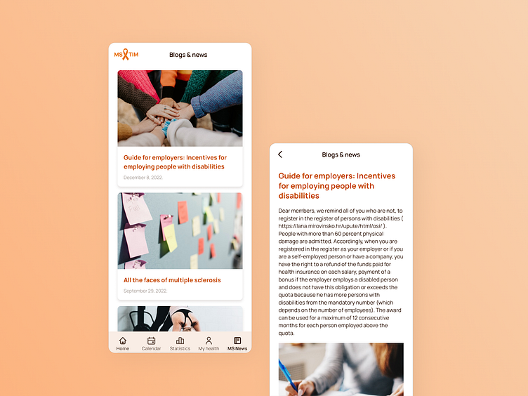
Based on this, we defined features and a plan for the second phase, which included developing a statistics feature for tracking progress, a document combining statistical and medical data for easier communication with doctors, improving existing features, adding a blog and news section, and creating a landing page to promote the app.
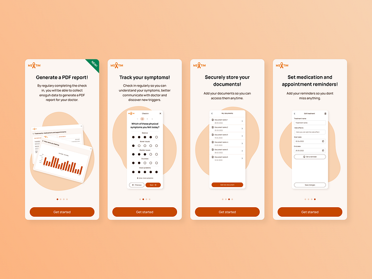
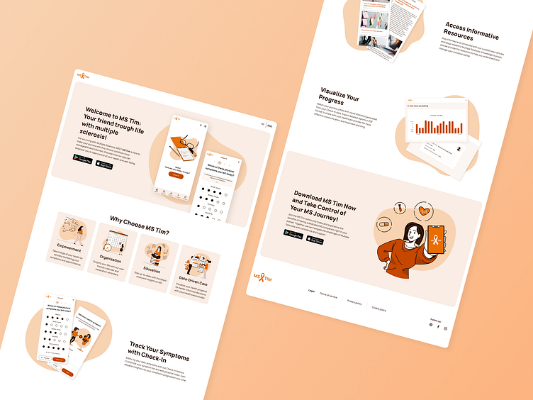
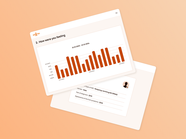
The statistics feature, another critical addition, enables users to review their health data over time, select specific periods to analyze, and generate documents combining these statistics with medical data from their profiles.
This feature helps users communicate their condition more effectively with healthcare providers.
Conclusion:
The final product of the MS Tim app is a comprehensive tool that allows users to manage their MS symptoms and treatment effectively.
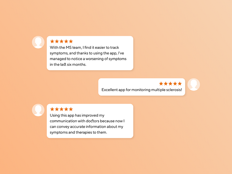
Screenshots show the clean and user-friendly design. The app's launch resulted in increased user engagement, with positive feedback highlighting the ease of tracking symptoms and managing medical appointments.
Reflecting on this project, the main challenge was designing for a highly variable condition like MS. Adapting the app to meet diverse user needs taught me the importance of flexibility and accessibility in design. The project also reinforced the value of continuous user feedback for improving product functionality.