Grievance Logo Concepts
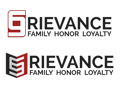
A friend of mine has a pretty cool gaming guild he's in, Grievance Gaming, and one of the things I thought was really unique was the cool use of the double "g" on their logo. I decided to take a stab at designing a couple interpretations of their logo for the hell of it.
I like the first one the most, because it's much more easy to discern the "G" and read it as "Grievance." The second one is a cool idea, but I don't think it translates well because you don't initially capture the "G" in there (and as some of my friends said, they wound up reading it as "Rievance"). Still, an amusing concept none the less - I thought the idea of it forming an abstract sort of shield would play well off of the chivalrous tagline they have.
If you're looking for a really laid back, friendly gaming guild, you really can't go wrong dropping by their forums and introducing yourself, so go do it!.
