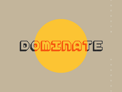
D O M I N A T E
I'm working on a monospace wordmark and it's incredibly difficult.
Any tips from you typographers out there? I know that the "M" gets a little dicey at smaller sizes. I also hate the visual weight of the "E" but I don't know of any ways to really get around it, feels out of place. Especially at the end of the word.
More by Mike Smith View profile
Like


