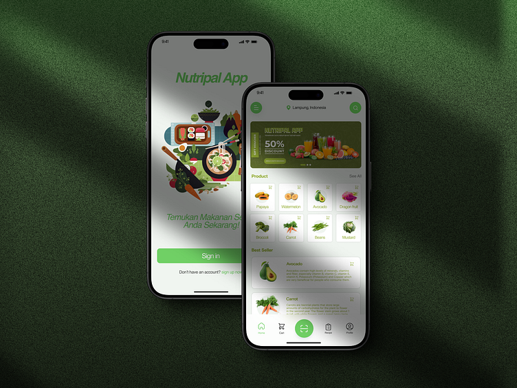
Nutripal - Mobile App UI
Case Study: UI/UX Development for the NutriPal Mobile App
Background
NutriPal is a mobile application designed to help users easily discover, order, and enjoy healthy food. The app offers various features such as restaurant and healthy menu searches, food recipes, nutritional intake tracking, and meal reminders. NutriPal’s primary goal is to provide an intuitive experience that motivates users to maintain a healthy lifestyle.
Objectives
Enhance the accessibility of healthy food for users.
Simplify the process for users to choose and order healthy food.
Ensure the app is user-friendly for a diverse demographic.
Design Approach
User Research
Surveys and Interviews: Collected data from 150 potential users to understand their needs, preferences, and habits regarding finding and ordering healthy food.
Personas: Developed three main personas based on research:
Alfi, 28 years old, young professional: Seeks healthy food to support her active and busy lifestyle.
Amar, 35 years old, fitness enthusiast: Wants to track nutritional intake and find recipes that support his fitness goals.
Ratna, 42 years old, homemaker: Needs healthy food options for her family and inspiration for healthy recipes.
Prototyping and Wireframing
Low-Fidelity Wireframes: Created basic sketches for the main page structure and user flow.
High-Fidelity Prototypes: Developed interactive prototypes using tools like Figma to gather more detailed feedback.
Design Principles
Simplicity: Simplified navigation with clear menus and easy-to-follow ordering processes.
Consistency: Used a consistent visual style throughout the app to help users easily learn the interface.
Accessibility: Provided accessibility features such as text enlargement, high contrast mode, and screen reader support.
User Testing
Usability Testing: Conducted usability sessions with 10 users from various personas to identify issues in navigation and feature use.
Feedback Loop: Collected feedback and iterated on the design based on findings from the testing.
Design Outcomes
Home Screen
Dashboard: Displays nearby healthy restaurants, special offers, and the latest health articles.
Bottom Navigation: Menu with icons for Home, Search, Orders, Recipes, and Profile
Search and Exploration
Filters and Categories: Allows users to filter by cuisine type, ingredients, calories, and price.
Personalized Recommendations: Displays restaurant and menu recommendations based on user preferences.
Restaurant and Menu Details
Comprehensive Information: Shows restaurant details, user reviews, and complete menus with images and descriptions.
Customization Options: Features to customize orders according to users' dietary preferences (e.g., vegan, gluten-free).
Food Recipes
Recipe Collection: Provides a variety of healthy recipes for users to follow.
Recipe Details: Displays ingredients, cooking steps, and nutritional information.
Nutritional Intake Tracking
Food Logging: Allows users to log their food consumption and track daily nutritional intake.
Nutritional Analysis: Provides detailed analysis of calories, protein, carbohydrates, fats, vitamins, and minerals.
Meal Reminders
Reminder Settings: Users can set reminders for meals at specific times to ensure they eat regularly and healthily.
Notifications: Push notifications to remind users about meal times and suggest healthy food options.
Conclusion
The user-centered design approach has helped NutriPal create an intuitive and functional interface. Users reported increased convenience and motivation in maintaining a healthy lifestyle through the app. Continuous user testing and iteration ensure the app remains relevant and responsive to users' needs.
