Redesign E-commerce Danny Wonker by SzabatDesign
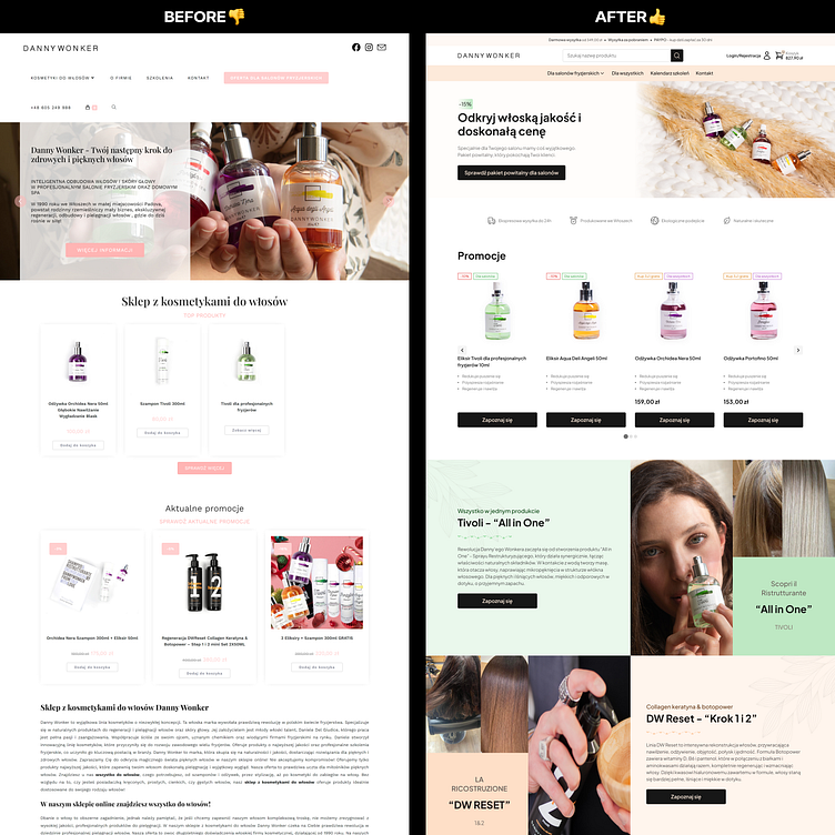
✏️Welcome to the world of Danny Wonker Polska! I present to you my latest project: a complete redesign of an entire online store. Let's focus on the specifics and how I can realistically help you with your e-commerce strategy and design in the future. I invite you to collaborate 🤝
🎯 Business Goals
Increase product sales.
Focus on B2B (95%) and B2C (5%) sales.
Increase B2B account registrations.
Hide B2B prices from B2C customers, showing them only after registration.
Build trust among hair salons.
Reduce customer contact on Facebook through the store.
Integrate hairdressing training with the store and products.
📉 Business Problems
Lack of highlighting top brand products.
Shopping difficulties due to the store not being properly adapted.
Poorly designed navigation and information architecture on the store.
Current store not tailored to the customer segment.
Lack of information about upcoming hairdressing training.
No strategy to increase cart value and orders.
No option to pay online for hairdressing training.
Poorly designed store appearance not matching the brand.
Current store does not inspire trust among new customers.
Not user-friendly for people wearing glasses.
😡 User Problems
Lack of detailed information on hairdressing training, its benefits, and schedule.
No cash on delivery option.
No choice of courier.
No discounts or promotions.
Prices of top brands are significantly higher.
Hair salons are usually closed on Mondays.
No information on when out-of-stock products will be available.
Lack of detailed product descriptions, usage instructions, and ingredients.
💡 My Solutions
Create a welcome package with a 15% discount for new B2B customers and make it a unique value proposition in the hero section.
Monthly promotion section to encourage repeat purchases.
Carousel of promotions on the homepage.
Top banner with free shipping information for orders above a certain amount and cash on delivery option.
Large buttons on mobile (52 pixels) to make it easier for women (95% of users) to shop comfortably with long nails.
10% discount on the next purchase for leaving a product review.
Highlight the top 3 brand products on the homepage.
Store tailored to two personas based on research.
Appropriate contrast on the store according to WCAG.
Highlighting the benefits of account registration on the login/register page.
Trust-building UX writing.
Icons displaying brand values in strategic places.
Social proof with customer review screenshots from Messenger.
Cross-sell on the product page.
Assurance of security with appropriate icons in the purchase paths.
Tags indicating whether a product is for B2B only or for everyone.
Training page with detailed descriptions, photos of the training, showcasing participants, and integrating brand products.
Generate emotions through photos of people.
Build trust in products with before and after photos.
Information about brand values in various places on the store.
Store design tailored to increase conversions.
And much more...
✅ What I've Done:
UX audit of the old store.
Surveys with current B2B customers.
Kick-Off meetings with the owner discussing current customer behaviors, business goals, competition, and brand vision.
Creation of personas.
Direct competition analysis.
Identification of competitive advantages among direct competitors.
Commissioning and overseeing new product photography.
SWOT analysis.
Finding the best solutions for the business goals of the owner and his customers.
Creation of a new information architecture from scratch based on collected data.
New User Interface for each subpage building trust and appealing to the target group.
Mobile-first design.
Preparation of Handoff for an external agency implementing the solution.
And much more...ext here...


