Delafé Logo Design
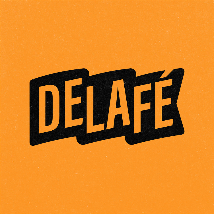
Stump and Roots collaboration with Delafé required a fresh re-design of a much older and harder to read logo that was in dire need of an update.
One of the most important aspects of logo design is ‘readability’. This was a main problem with the old Delafé logo.Logos must be clear and understood from a variety of sizes and in different applications (on a small phone vs on a larger tv screen).In the original logo, the é at the end of delafé was too distorted. The other problem was that people read Delafé as ‘De-laugh-ee’, not de-la-fe as intended.
Separating the word mark into three distinct syllables helped emphasize the correct pronunciation while keeping true to the elements of the original logo: a flag. By re-imagining the logo and visual brand identity Delafé was able to communicate a more fresh design to their 707k subscribers on YouTube and other social media platforms.
