Identity Guidelines - Barkahlabs Agency

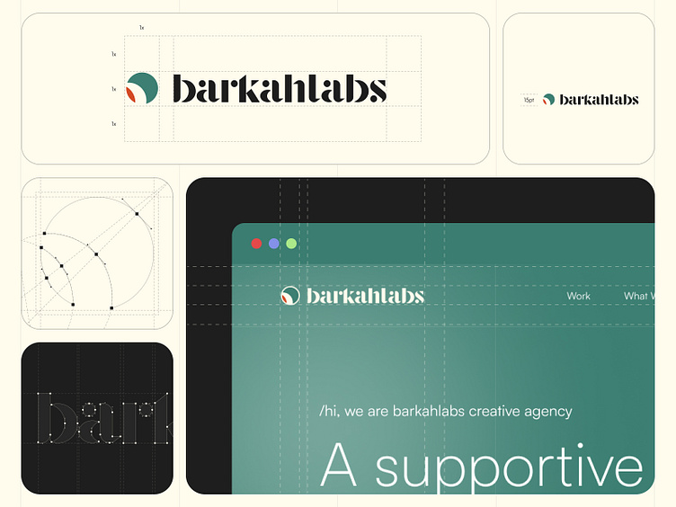
Clearspace
Minimum Size: To ensure clarity in both digital and print formats, our logo must not be reproduced smaller than the specified dimensions shown here.
Clear Space: Our logo needs room to shine. We've set clear space guidelines to prevent any elements from encroaching on its visibility and impact.
Primary Color
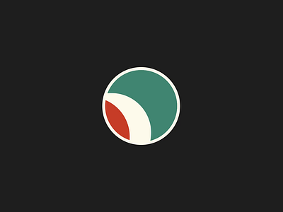
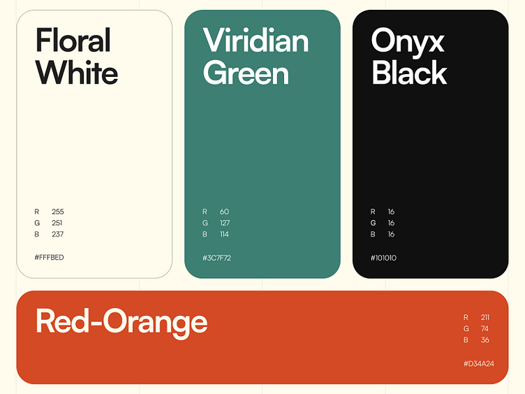
Our primary color palette features a harmonious blend of neutral floral white, bold black, and our carefully curated green. A vibrant red-orange accent also appears in our logo.
These primary colors are carefully used across all Barkahlabs communications, ensuring a cohesive and recognizable brand identity.
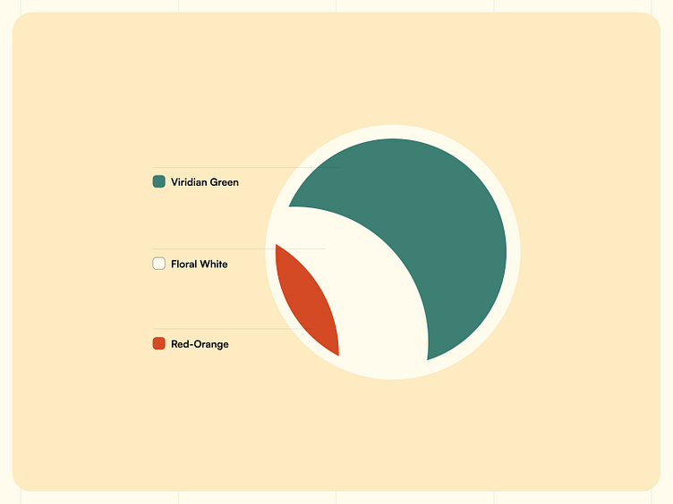
Color Representation
Green represents the values of balance, harmony and growth.
Red-Orange represents motivational values, action, instinct and optimistic spirit.
Floral White represents an awakening of openness, creativity and refreshing energy.
Kindly visit our Behance for more details 🚀
✱ ✱ ✱
Thanks for checking it out!
Interesting for collaboration with us?
Contact us at hi.barkahlabs@gmail.com
or visit our website barkahlabs.com
Check us more at: