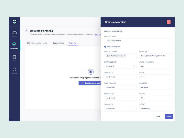
Project Screen Empty State (Create New)
The design:
We recently worked to support the product team redesigning aspects of the platform and releasing new features. The tool is a B2B partner collaboration software that ensures they stay aligned and engaged, send comprehensive updates, track assigned tasks, and monitor shared initiatives and opportunities.
The goal:
To work with a complex platform, release new features and give the UI a lift. The software also has a lot of a tables so one of our challenges is to manage complex tables.
The challenge:
This design shows the empty state for the project screen. We wanted to create a call-to-action to encourage the user to get started populating projects with their partners. This view shows the 'create new' interaction which opens a fly-out window for the user to enter their project details.
So, what do you think? 👀
Work with us!
UserActive is a product design agency for B2B SaaS. We’re on a mission to help SaaS Founders create meaningful products users love.
Book a call 👉🏼 www.useractive.io
